Gideon Adeyemi
Product Designer
London, UK
20:11:58
Jóga, Björk ...

Interfaces Remember Physics
Designing motion that agrees with the body
Nobody meets an interface for the first time. By the time a person touches a screen, they already understand an enormous amount about how the world behaves. In reality, objects resist before they move, actions create reactions, and change occupies time.
This knowledge lives in the body and in the mind.
I’ve been documenting my work on this lately, on how interaction design works best when it respects that inheritance. When it builds on what people already know, rather than asking them to learn an entirely new physics.
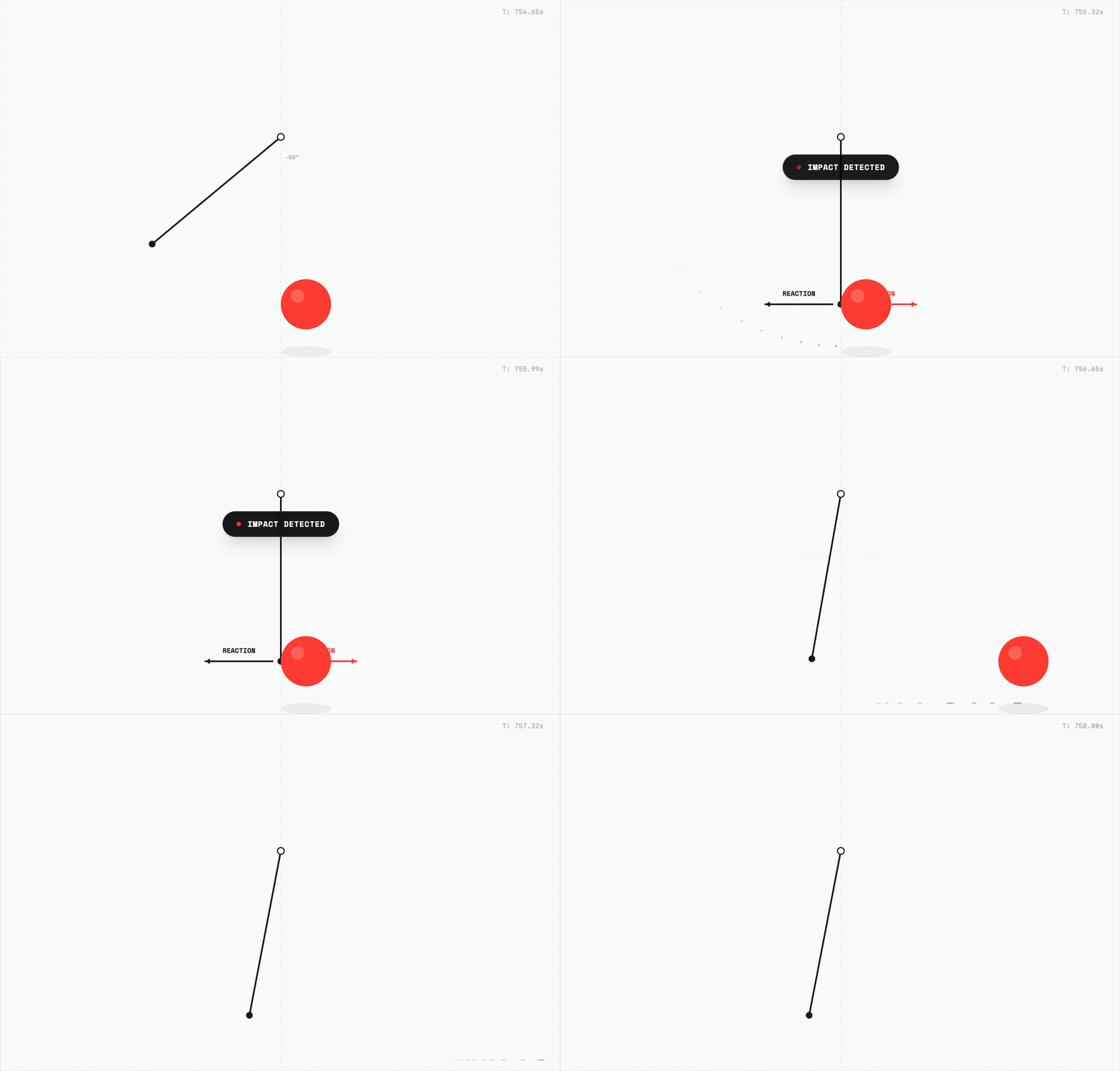
Think about what a tap really is
Calling it input is correct, but incomplete. A tap is a search for confirmation. In the physical world, confirmation arrives through mechanics. When you kick a ball, it travels in the intended direction if there’s no interference. When you hit a switch, it compresses. Something pushes back and then gives way.
With glass (digital interfaces), all of that disappeared.
What remains is interpretation. The interface has to construct a response using motion, colour, and timing, like small compressions, highlights, or shadow adjusting under pressure, often within a fraction of a second.
I observe UI motion patterns in great products and notice how I feel when interacting with them. A button designed so that when you tap it, it doesn’t just change colour; it scales down slightly, maybe 96% of its size, before bouncing back. That tiny compression creates the illusion of depth. Of something giving way under pressure.
Compare this to poorly designed interfaces where buttons simply swap colours on tap. They feel dead. People tap again, uncertain if the first tap registered, because their body expected some acknowledgement of the force applied.
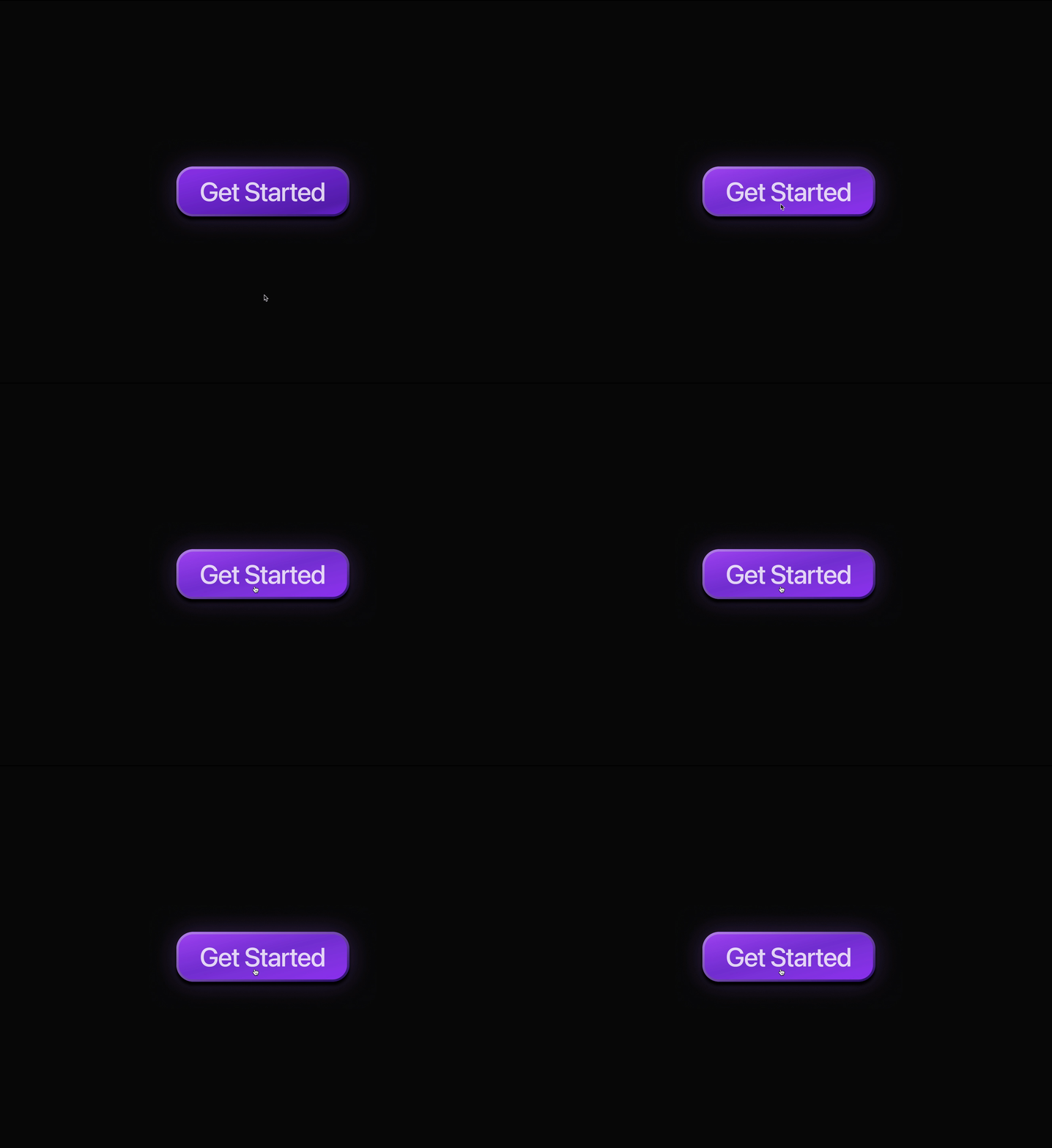
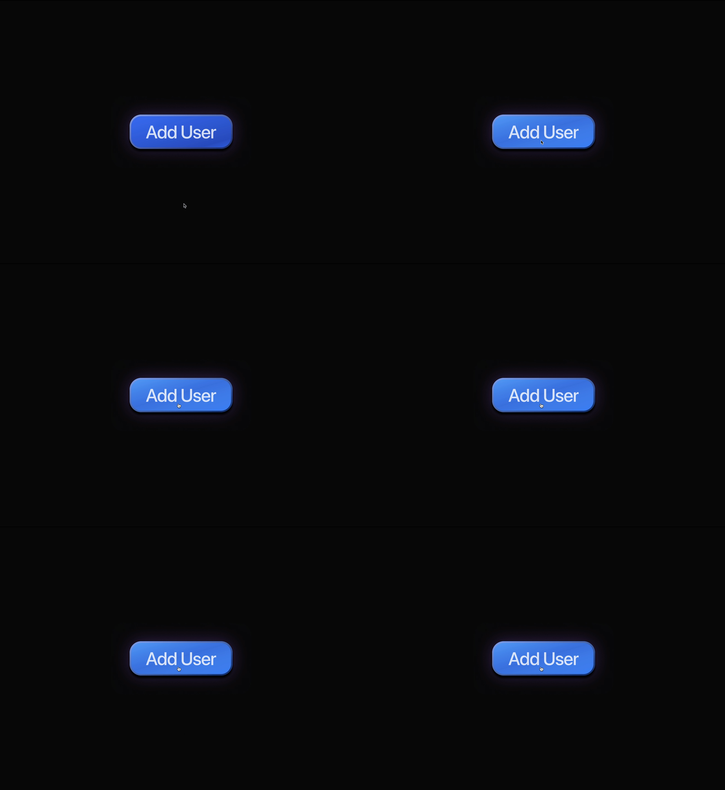
I understand you.
That’s what these signals say. When they’re weak or absent, people repeat themselves. They tap again because doubt is uncomfortable. Uncertainty always makes humans escalate.
Motion helps the system explain itself
Interfaces reorganise constantly. Controls move. Views replace other views. Information changes responsibility. Without continuity, these updates can feel arbitrary, as if the ground shifted without warning.
Animation provides a thread.
Something small becomes something large. Something peripheral becomes central. The relationship survives, and the user remains oriented because the interface kept the story intact.
I keep coming back to how Apple handles the transition from an app icon to the app itself. The icon expands outward, growing into the full application rather than an instant reveal. Your eye can follow the transformation. You know exactly where you are because you watched yourself arrive there.
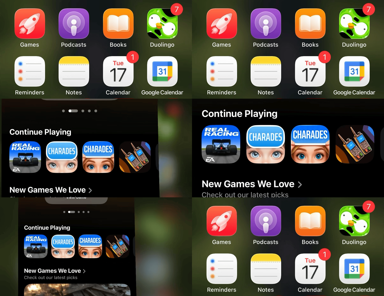
When I use phones that simply cross-fade between states, I feel disoriented. Did I open this app? Or did the phone just show me something? The missing motion creates a tiny moment of confusion that I only notice in its absence.
Trust is built this way, quietly.
It is tempting to believe that faster always means better
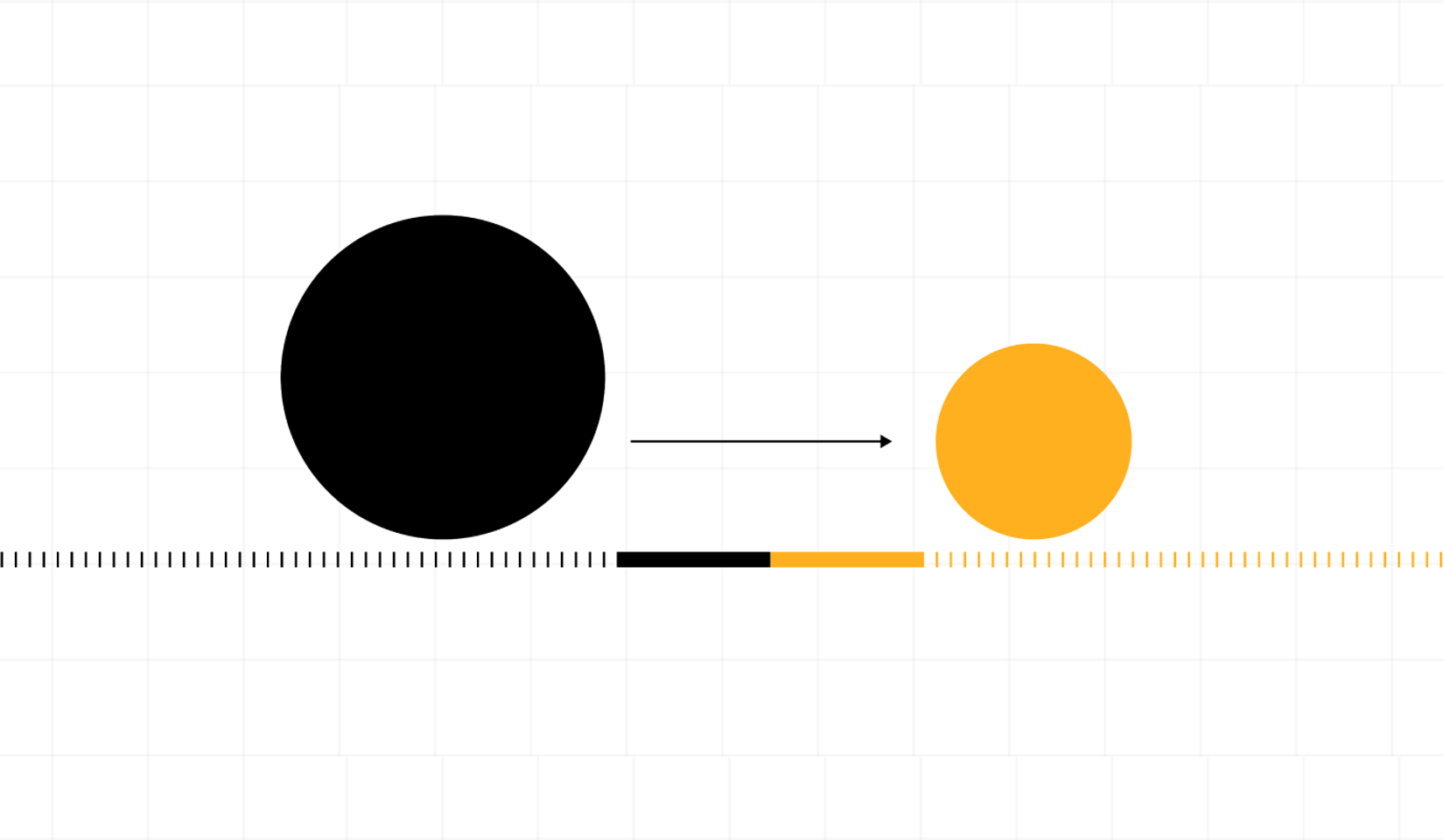
Software can respond instantly, which sounds great, right? Yet when response and action share the same moment, causality weakens. It becomes harder to see what happened because of you and what happened anyway.
A brief duration restores the link. Action happens, Change unfolds as feedback, and in unfolding, it becomes understandable.
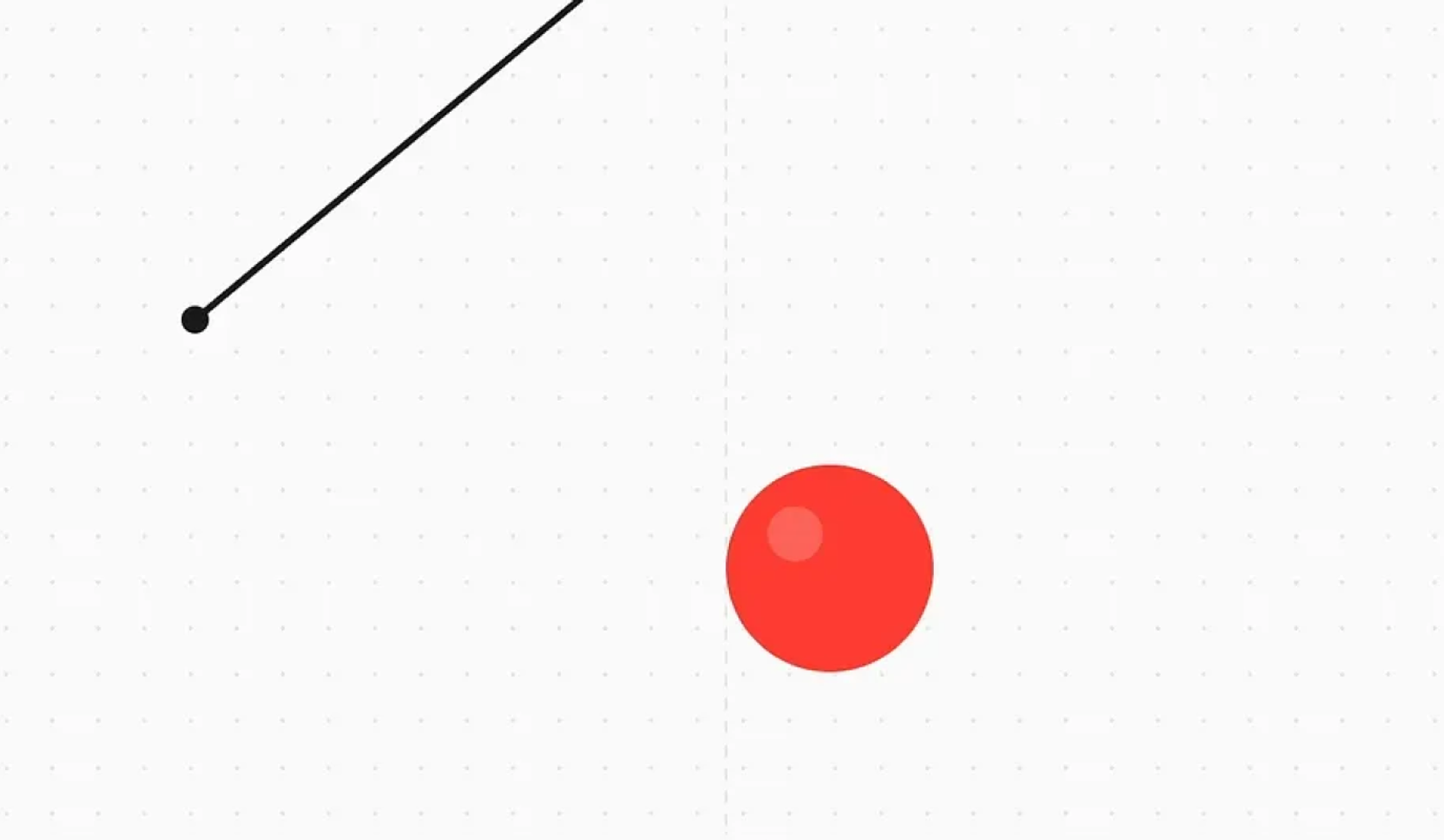
A little time to show the digital representation of Newton’s Law of Action and Reaction can carry meaning.
Not every action deserves identical treatment
Some interactions are light and frequent. Others carry risk. Some should pass almost invisibly. Others should feel deliberate. When motion ignores these differences, the interface loses emotional range. Everything begins to feel equally important, which is another way of saying that nothing is.
Variation gives the system tone.
You can see different interpretations across thoughtful products. There’s interaction variation based on the type of action; is it destructive? Does it require a processing phase? Does it update a small part of the view? Does it update the entire view? Others depend on the weight or behaviour, static? Fluid? Reactive?
Apple often lets elements travel so they remain traceable between contexts. That app icon expansion I mentioned earlier, or how a photo grows from a thumbnail to fill the screen while maintaining its position in your mental map.

Linear prefers tight, efficient movement that reinforces precision. Their animations are fast but never instant. Just long enough to show you what changed. Watch how a task moves between columns; it slides with purpose rather than teleporting.
Notion stays restrained, allowing reading and thinking to remain uninterrupted. When you drag a block, it lifts slightly; the motion is dampened, gentle enough to keep focus. The item being moved becomes slightly transparent to ensure the content behind is visible, and to convey that the item has no defined position at that exact moment (a ghost element). It snaps into place on completion without exaggerated motion since you are expected to be busy documenting.

Different philosophies, same respect for expectation.
There will always be a desire to invent
New gestures, new transitions, exaggerated motion, new ways of navigating space. Some inventions become progress. They reshape instinct and eventually feel inevitable.
But each departure from familiarity requires effort. Predictions must be revised. Habits must be updated. If we demand this level of change too often, the interface becomes tiring to use.
I still try to figure out where the line is between innovation that delights and innovation that exhausts. I think it depends on whether the new pattern solves a real problem or just demonstrates that something different is possible.
Working with physical intuition is powerful because the learning has already taken place and the cognitive requirement is less of a burden.
When interaction aligns with anticipation, attention moves on. Toward the task. Toward the idea. Toward the reason the product was opened at all.
Mechanics fade because they feel unquestionable, not because they disappear.
This is where design begins to feel mature.
Interfaces are built from pixels and code. The experience of them passes through memory, through years of touching, moving, and waiting for the world to answer back. We can ignore that memory, or we can build with it. The second option tends to feel better in the hand.
My takeaway? The best interactions borrow from physics not just because they simulate reality, but because our bodies already speak that language. When we design with that understanding, users don’t spend every moment learning or getting used to something new; instead, we're having a conversation in a language they've known since childhood.
0%...
Because the smallest design
decisions can change how we
all experience the world...