Gideon Adeyemi
Product Designer
London, UK
20:11:58
Jóga, Björk ...


Product
Yana
Role
Product Lead & Designer
###
Credit, Finance, AI, Gamification
Platform
Web & Mobile
Problem
A fundamental gap existed on both sides of the credit ecosystem. Borrowers couldn't understand or prove their creditworthiness. Lenders don’t have efficient ways to identify qualified leads, spending days manually verifying applicants; most of whom didn't qualify anyway.
Solution
I designed a two-sided platform that bridged both gaps. A visual credit suite helping borrowers understand and improve their scores, while linking them with the right lenders, and an origination dashboard giving lenders pre-qualified leads with verified credit data, cutting down qualification time.
Impact
- Over 50,000 qualified leads generated
- 20+ lending partners actively using the platform
- 31% lead conversion (vs 8% industry standard)
- Lead qualification time: Under 1 hour
- 78% onboarding completion, up from 34%.
Product
Yana
Role
Product Lead & Designer
###
Credit, Finance, AI, Gamification
Platform
Web & Mobile
Problem
A fundamental gap existed on both sides of the credit ecosystem. Borrowers couldn't understand or prove their creditworthiness. Lenders don’t have efficient ways to identify qualified leads, spending days manually verifying applicants; most of whom didn't qualify anyway.
Solution
I designed a two-sided platform that bridged both gaps. A visual credit suite helping borrowers understand and improve their scores, while linking them with the right lenders, and an origination dashboard giving lenders pre-qualified leads with verified credit data, cutting down qualification time.
Impact
- Over 50,000 qualified leads generated
- 20+ lending partners actively using the platform
- 31% lead conversion (vs 8% industry standard)
- Lead qualification time: Under 1 hour
- 78% onboarding completion, up from 34%.
Turning Yana’s 50,000 "Unqualified" Borrowers Into Qualified Leads Through Motivation Affordances and Data
The impact:
Months after we shipped the new design, we generated: Over 50,000 qualified borrowers. A 31% lead-to-loan conversion rate in a market where 8% is standard. Over 20 lending partners actively using the product for credit origination; results that are in line with Yana’s mission to close the lending market gap.
On this product, I wasn't some external designer parachuted in with fresh eyes. I'd spent three years at a lending company, watching us reject 85-90% of loan applications week after week. Not because people were risky, but because we had less reliable ways to prove they weren't.
So we stopped lending. The company pivoted to build infrastructure to solve this problem. I led product and designed the end-to-end UX of this credit suite.

What We Were Building
Yana started as a lending company. After years of hitting the same wall- high acquisition costs, brutal rejection rates, capital sitting idle. We pivoted to build tools that fix these problems for lenders and borrowers.
We built a two-sided platform:
For borrowers: A credit suite that simplifies credit and financial data, provides actionable improvement plans, and links users with lenders who want them.
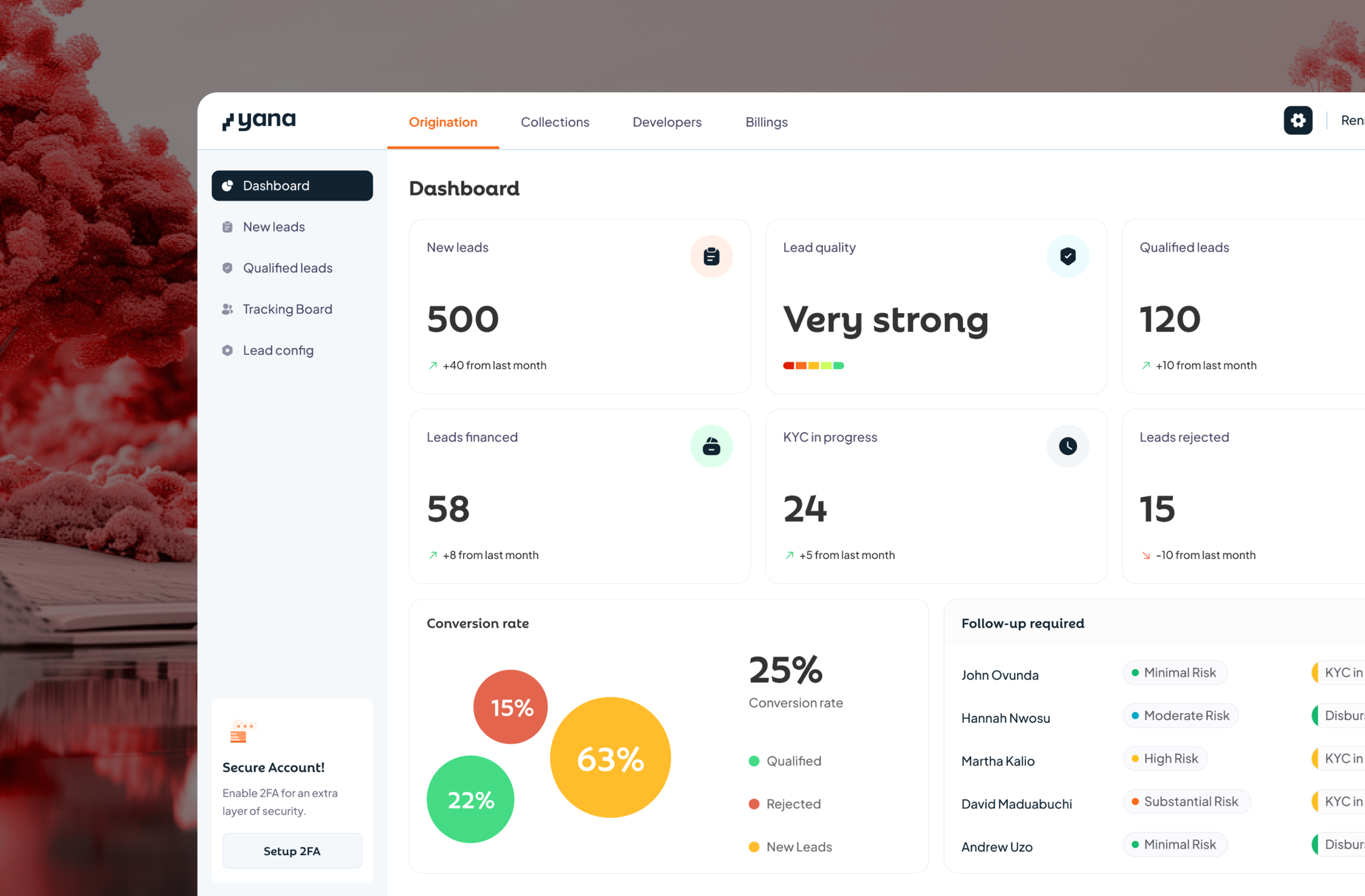
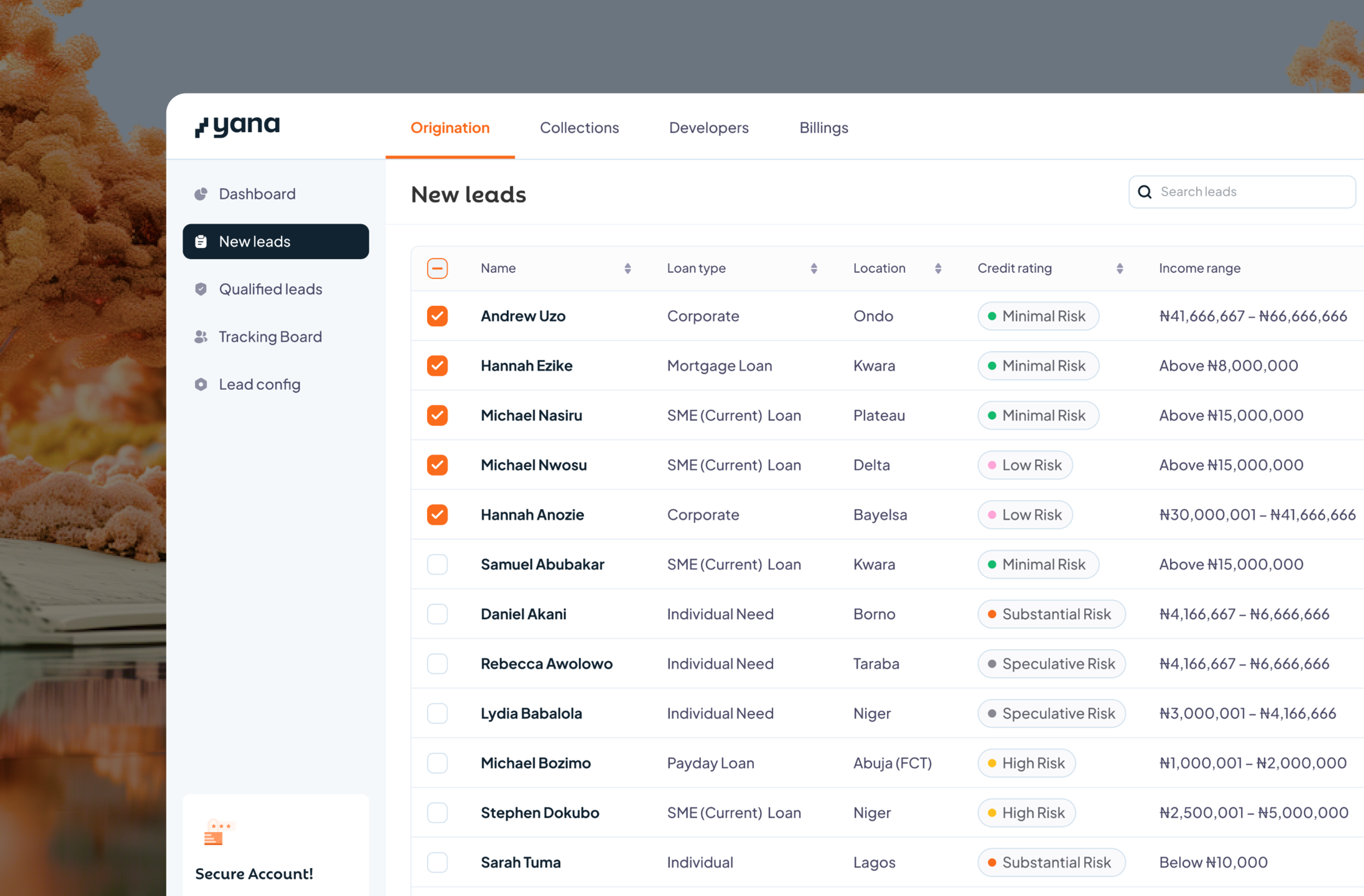
For lenders: An origination dashboard that delivers these borrowers as pre-qualified leads with verified credit data, cutting qualification to minutes.
I designed both products, led research and analysis to identify the problems and why they occur. Ella, the CEO, kept me honest, questioned my assumptions, and co-piloted analysis as we made the call on what to build and what not to build.
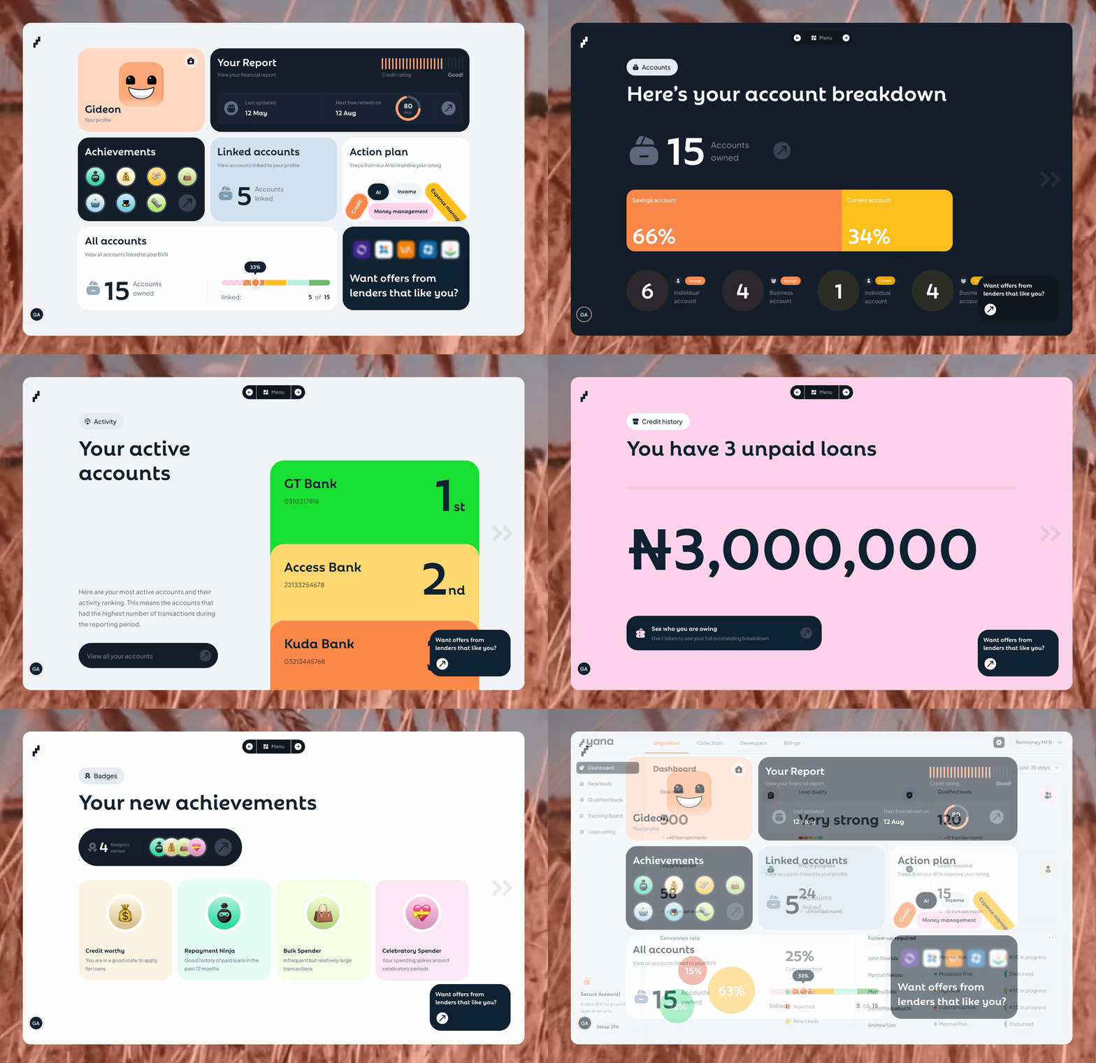
The Problem: Local Credit Barriers
Throughout our years as lenders, we'd reject a large percentage of loan applications every week. The math was killing us: we were spending a lot per customer, and approving barely anyone, while watching capital collect dust.
Problems lenders like Yana face: Poor credit history data. No centralised medium for financial data. Origination was manual hell. Sorting through applications by hand. Calling references. Waiting days for bank statements. Guessing at creditworthiness based on gut feel and incomplete data.
Meanwhile, borrowers saw credit as something to fear. The ones who applied often had no idea what lenders watch out for, or how to build eligibility.
The entire ecosystem was broken, and we needed to solve this problem.

Pushing Beyond Our Assumptions
What I thought was happening:
I assumed the problem was on our end. Maybe our criteria were too strict? Maybe we needed better marketing to attract quality applicants? Maybe we needed more capital to approve more loans and improve the unit economics?
The team debated raising another round to scale lending operations. "If we just approve more people, the numbers will work out."
What research revealed:
During a team retrospective, our CEO pulled up the data that addressed this.
"We're spending industry-standard amounts to acquire customers," she said. "The problem isn't our efficiency. It's that we're rejecting almost everyone who applies. We're not solving a lending problem; we're hitting an infrastructure problem."
I started digging deeper through journey analysis and usage analytics of our existing product, and user research. I spoke to many users, a mix of approved borrowers, rejected applicants, and people who'd never applied for credit.
Three themes emerged from this user research; they became the foundation of every design decision I made.
- Users see credit as something they need to avoid
- Users don’t know what lenders want
- Lenders need qualified users upfront

Users don’t know what lenders want
Users who applied had no idea of what lenders wanted. They'd apply with bad credit history, unclear income sources and documents, not because they were hiding anything, but they don’t know how to be eligible.

Users see credit as something bad
Users didn’t avoid credit because they were financially irresponsible. They avoided credit because they didn't understand it. Multiple interviewees used the word "scary" unprompted.

Lenders need qualified users upfront
I observed lending companies and watched them sort through hundreds of applications. Saw the frustration when they found a promising candidate but had to reject them because they didn’t meet their criteria.
The Real Problem
This wasn't a lending problem. This was a two-sided information gap.
Borrowers didn't understand credit and had no guide for building eligibility.
Lenders waste resources onboarding users who end up not fitting their criteria.
Learnings:
Linking lenders to borrowers that already fit their eligibility criteria will reduce the rate of rejections and increase profit for lending companies.
This means borrowers need a product that helps them manage their eligibility
The product needs to go beyond just a credit reporting tool. It needs to reframe credit from "something to avoid" to "a financial tool to understand and use."
Borrowers need plans and guides that’ll help them build creditworthiness.
We needed to design a solution that guides users about credit and gets them prepared to fit lenders' criteria, while lenders get access to credit-ready users.
The Solution: Design the Infrastructure Both Sides Need
My approach: For borrowers, I focused on financial data provision and visualisation, credit education, motivation affordances, and exposure to credit offers. For lending companies, I designed for data accessibility and presentation, process automation, origination management, and preference flexibility.










DECISION 1: Make credit visible, not scary
The Challenge:
People avoid credit because they don't understand it and fear its “stigma”.
What I Tried:
- Generic credit education content (Failed; Nobody read it)
- Chatbot that answered credit questions (Failed; users said it felt robotic and less personal to their specific context)
- Traditional credit report format (In test, users found it overwhelming and weren't interested in engaging more with it)
Final Design Choice:
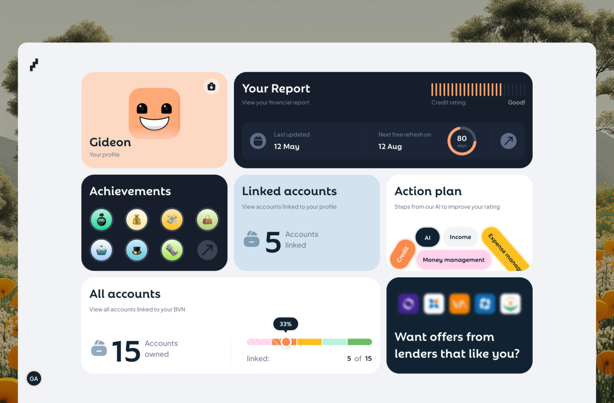
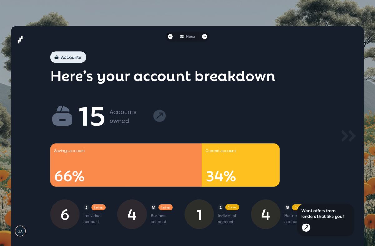
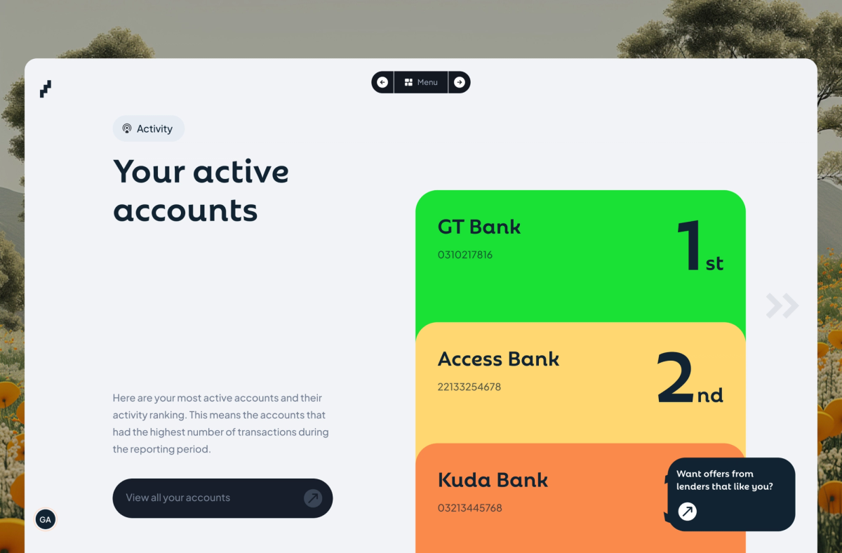
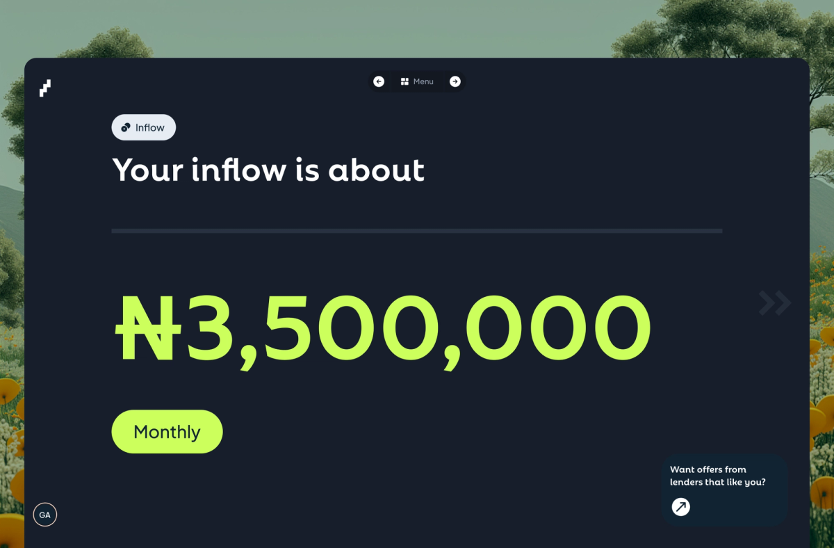
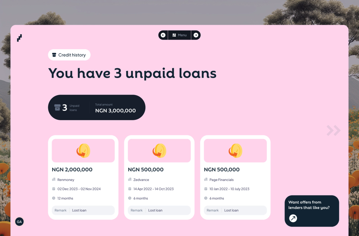
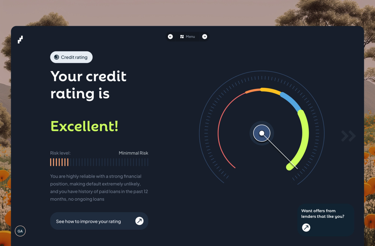
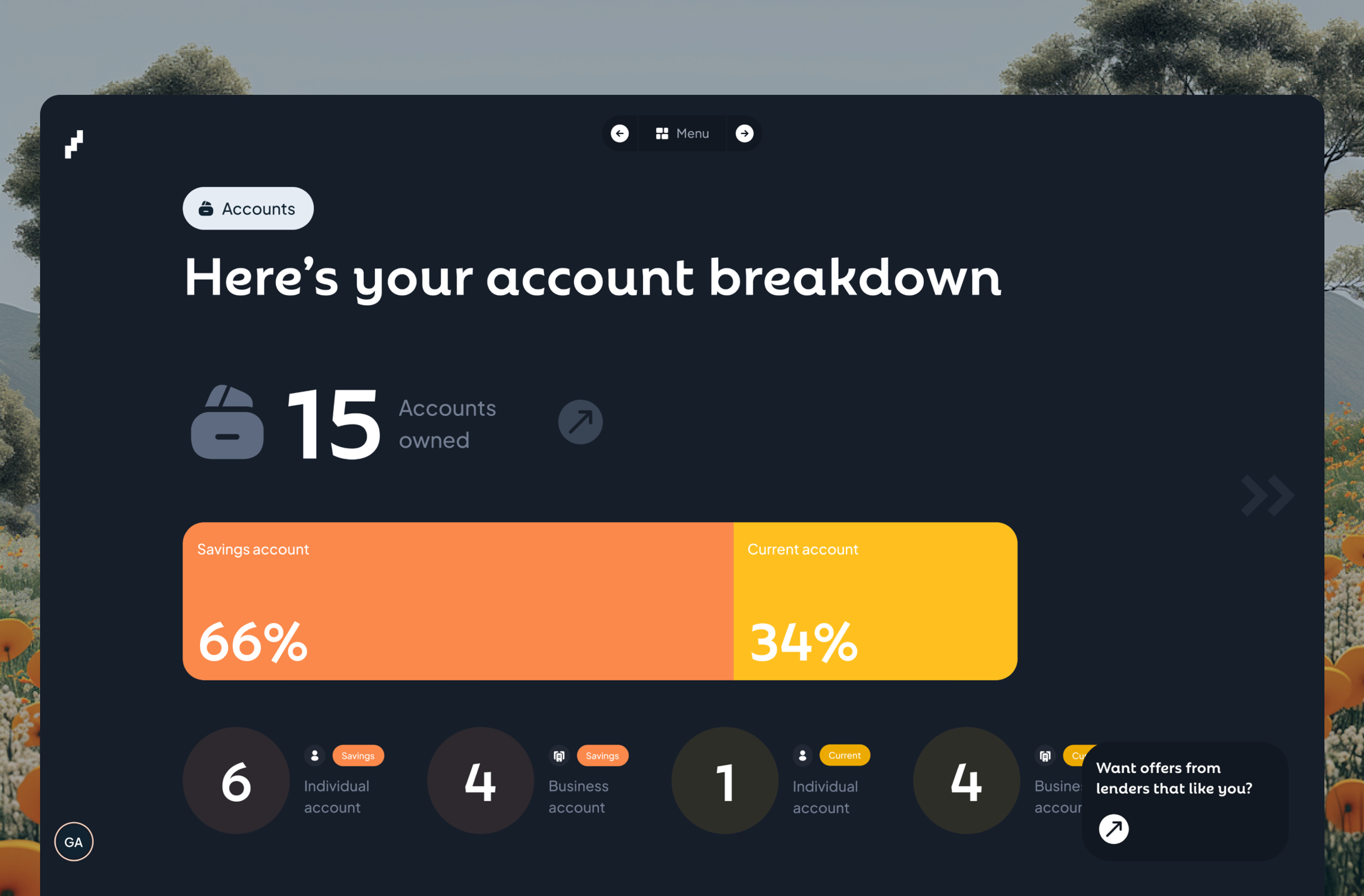
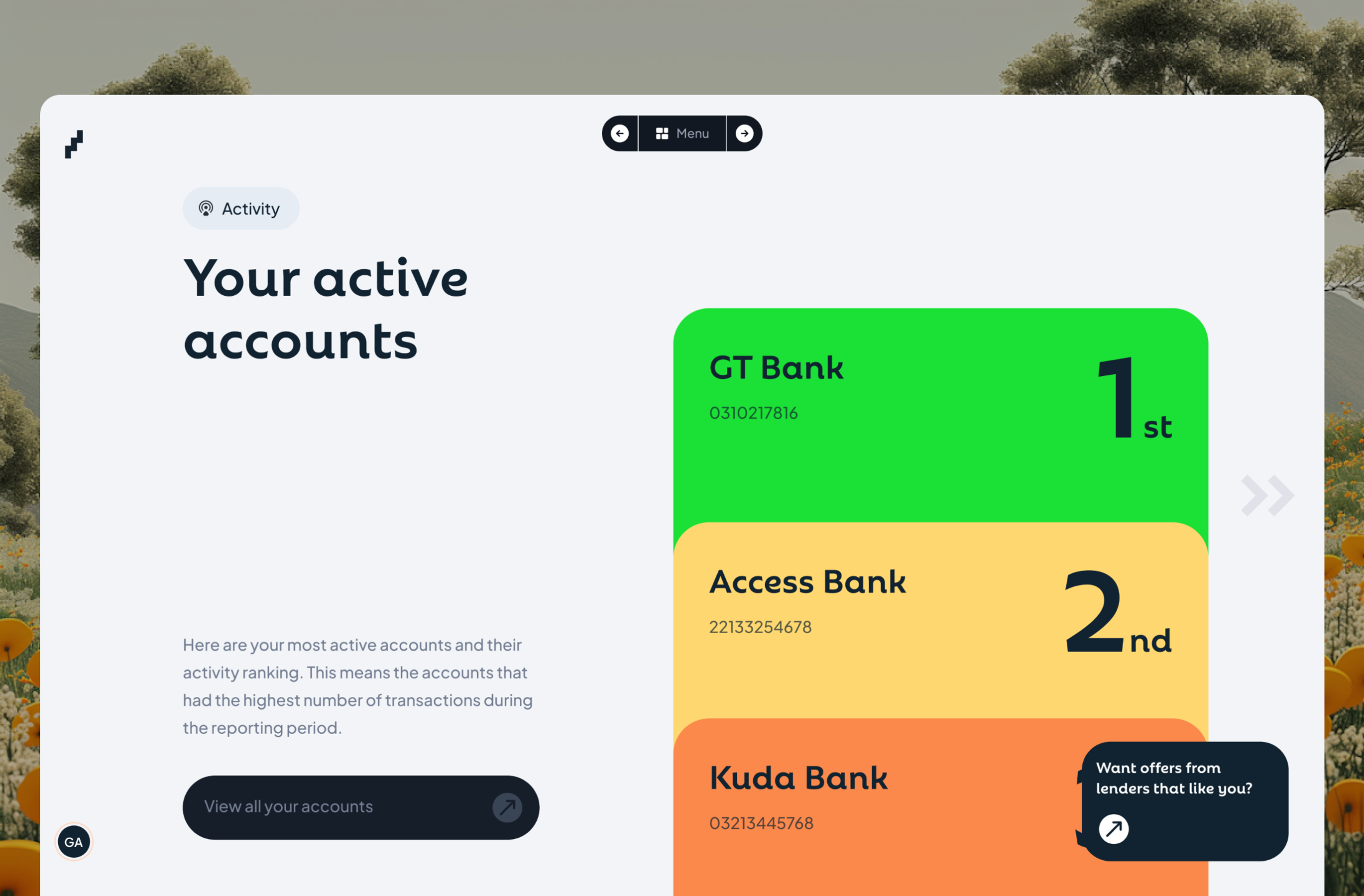
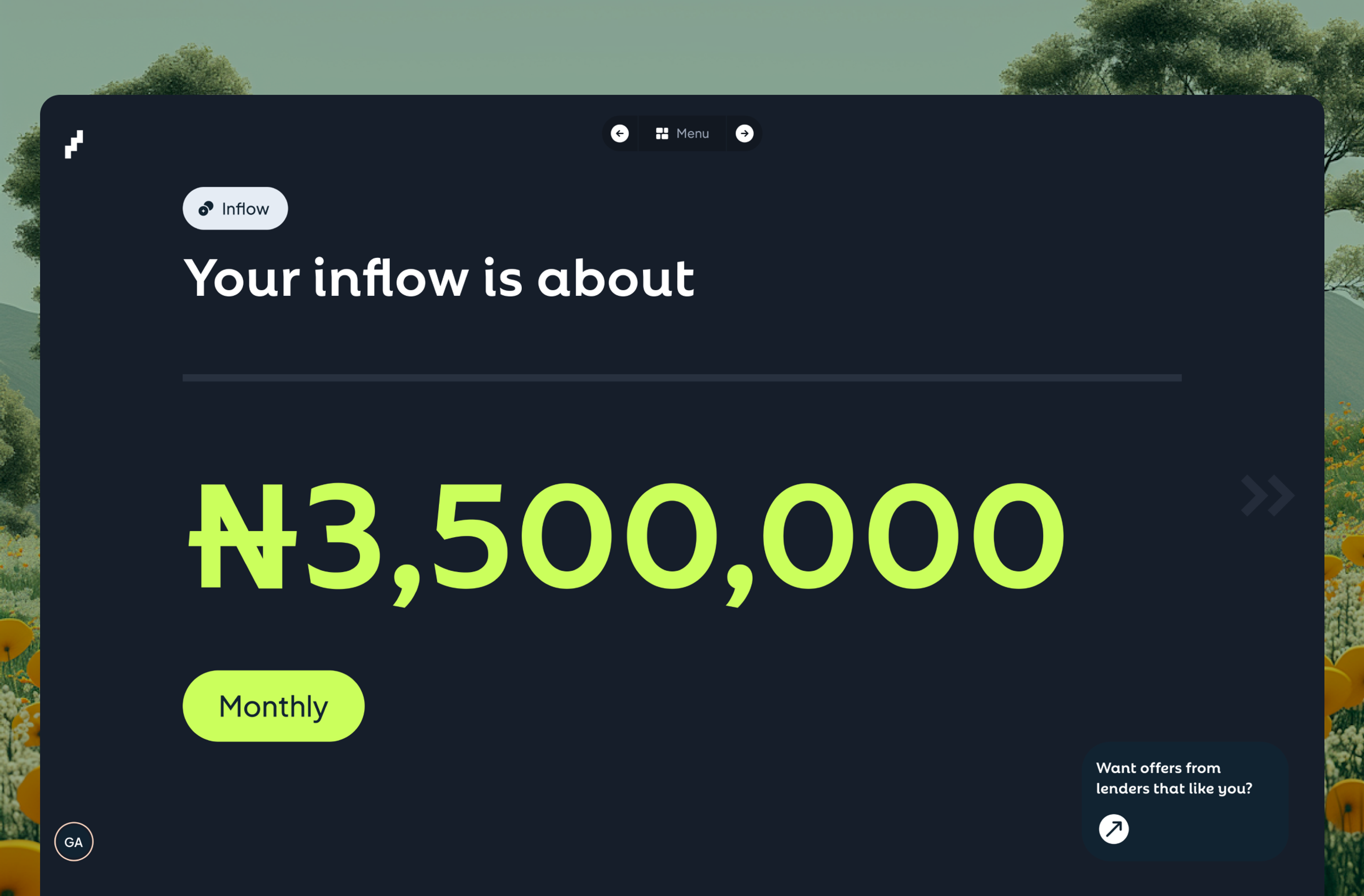
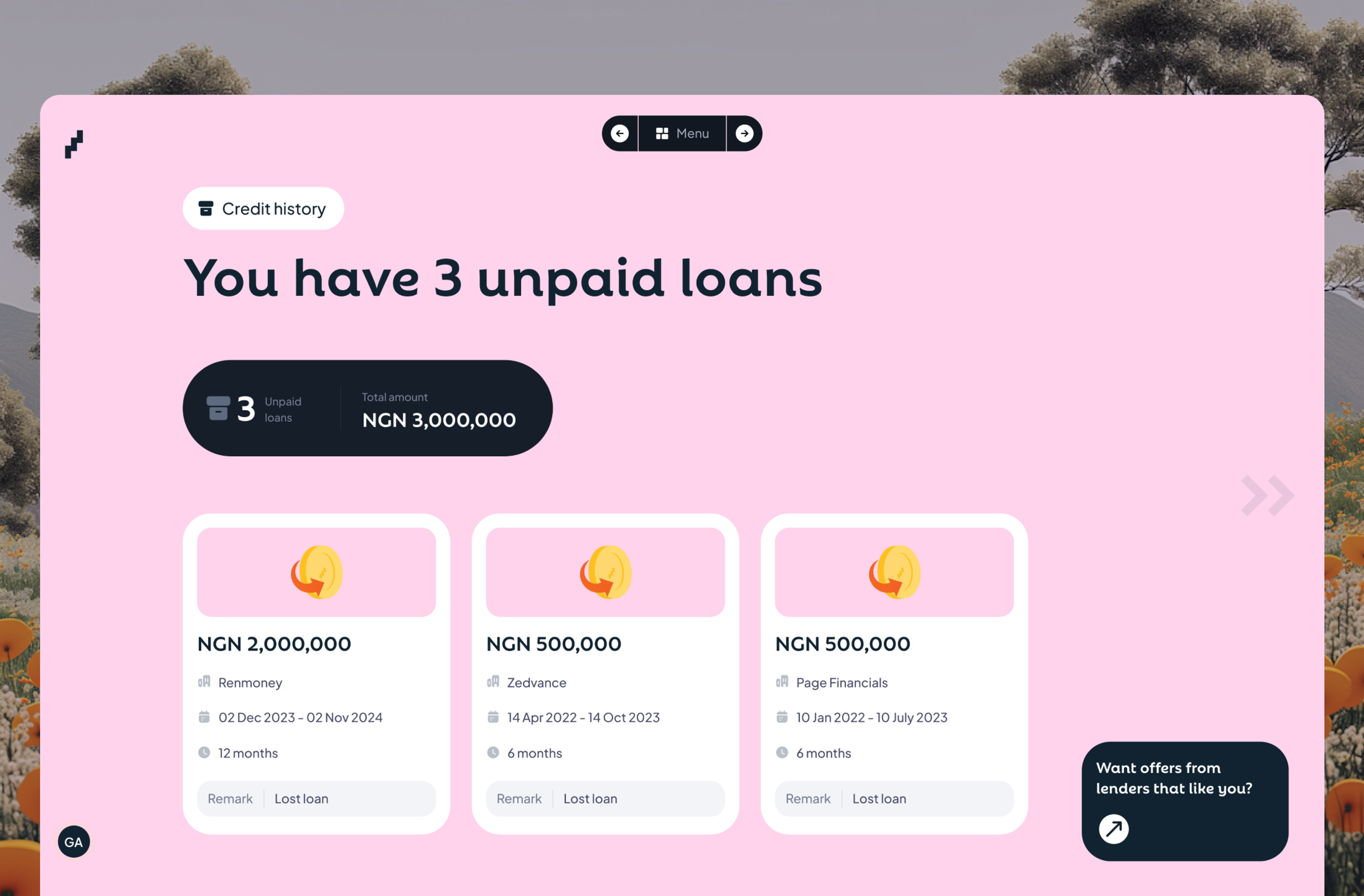
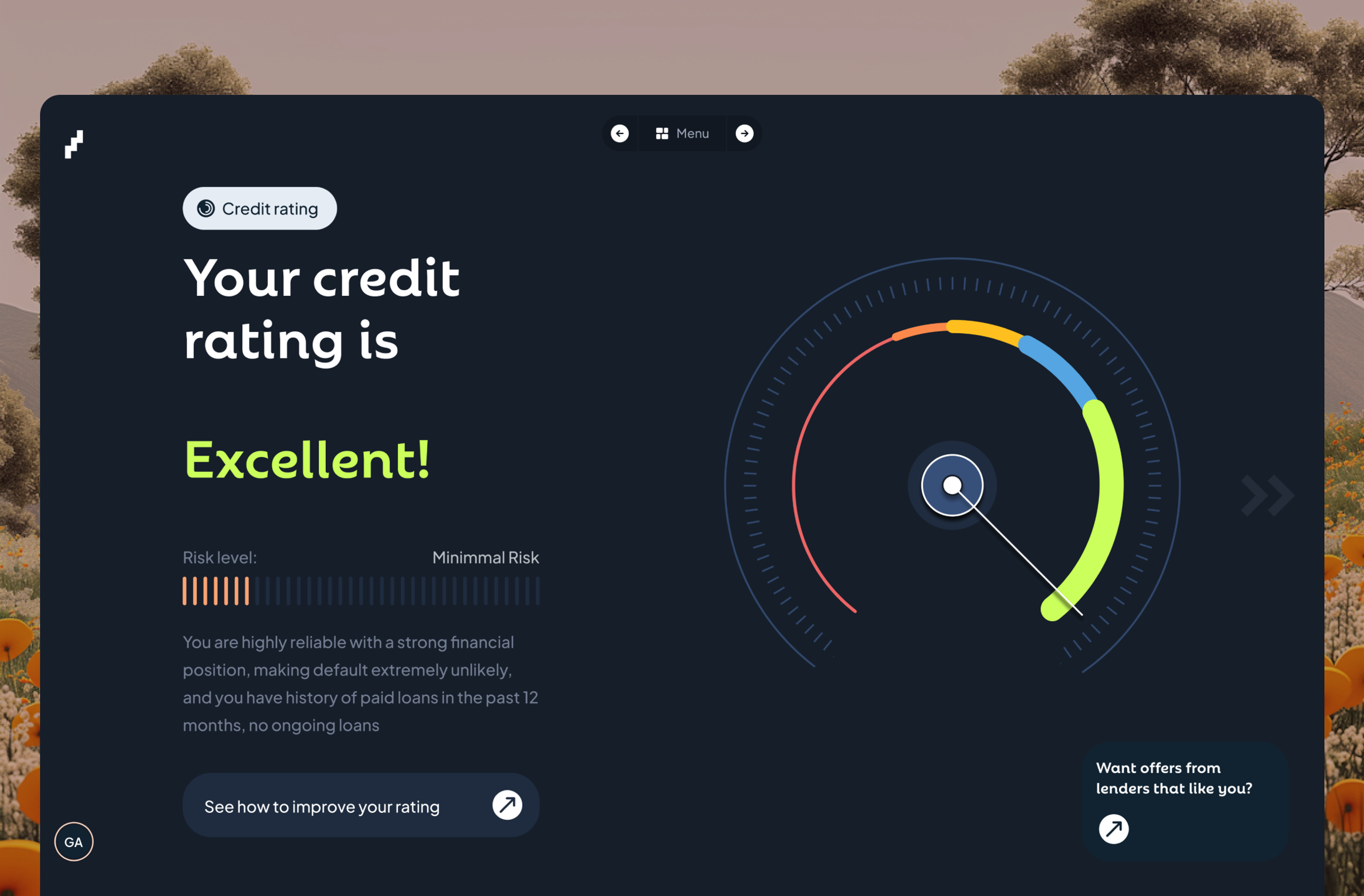
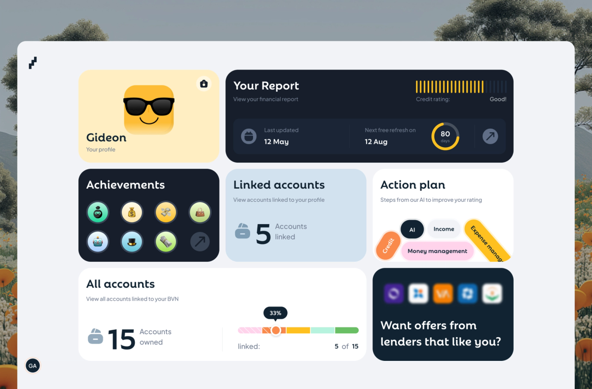
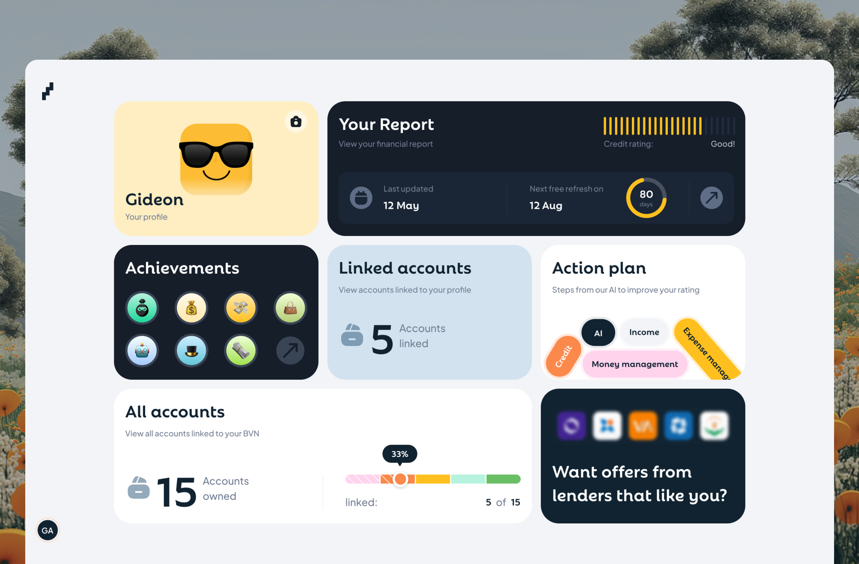
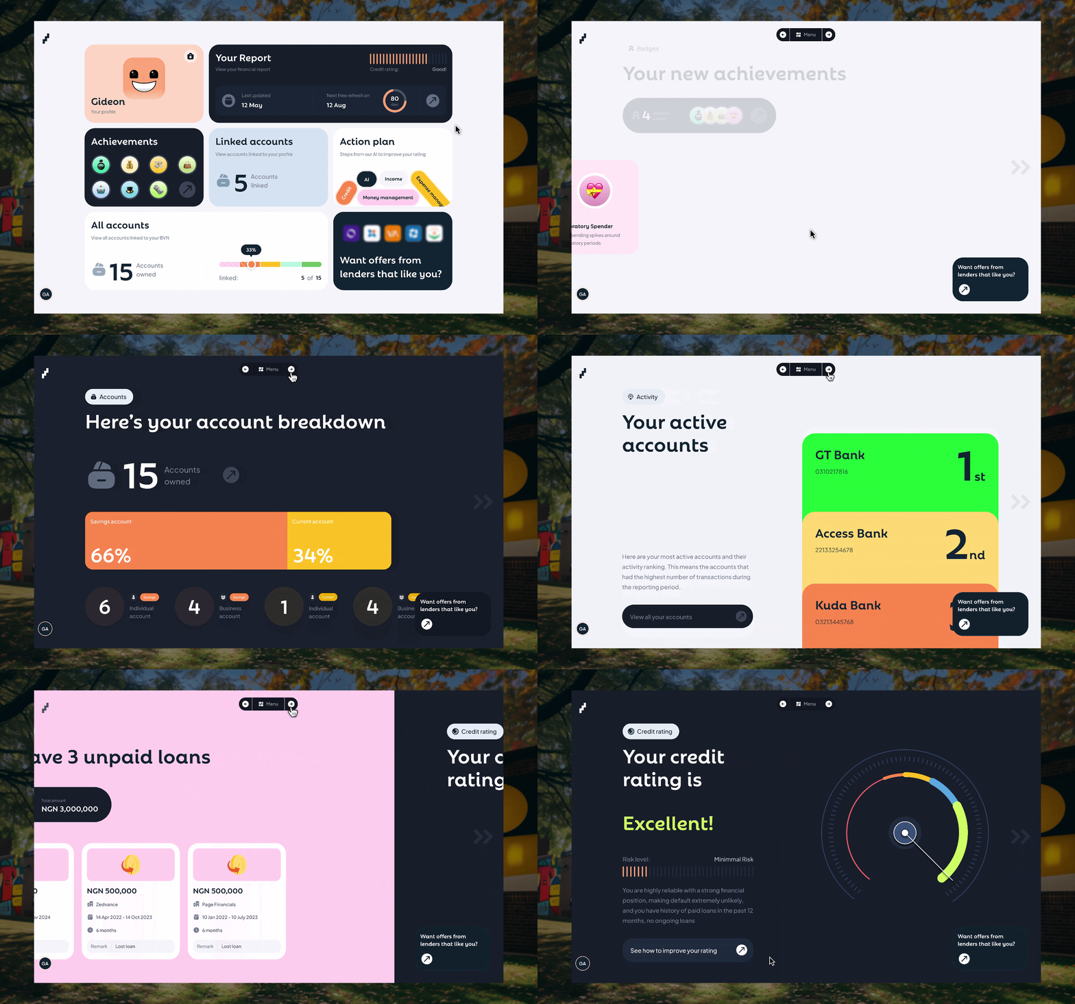
Create a completely new visual language for credit reporting. Use colour-coded gauges instead of just numbers. Show account activity as visual timelines. Turn improvement areas into achievement-style progress bars.
I ran tests comparing traditional vs visual formats. 73% of test users claimed it was a lot to process. The other version of the report with engaging visuals? 78% called it “educational” and "easy to understand."
To ease users into this new format, I designed an experience that balanced traditional and the new visual report assimilation approach.
Why It Worked:
When you show people their credit as an engaging visual story instead of a bank statement, they actually understand it better. And when they understand it, they engage with it. Return rate proved it: users came back 3x more often with my newly designed visual financial report format.
The design instinct was right. You have to fight for what the data and subjective user behaviour tell you, even when it goes against conventional wisdom.
DECISION 2: Give lenders the data, let them decide
The Challenge:
Lenders don't trust black-box algorithms. They need to see raw data to make lending decisions they can defend to credit committees.
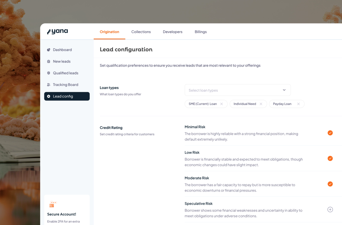
Different lenders also need to be able to tweak the pool of new leads to any preference that fits their varying criteria and qualification processes.
What I Tried:
- Auto-scoring leads 1-10 with ML algorithm (Lenders didn't trust it, demanded to see source data)
- One-time setup of qualification criteria preferences (Not sufficient; they needed the ability to tweak it whenever their operations changed)
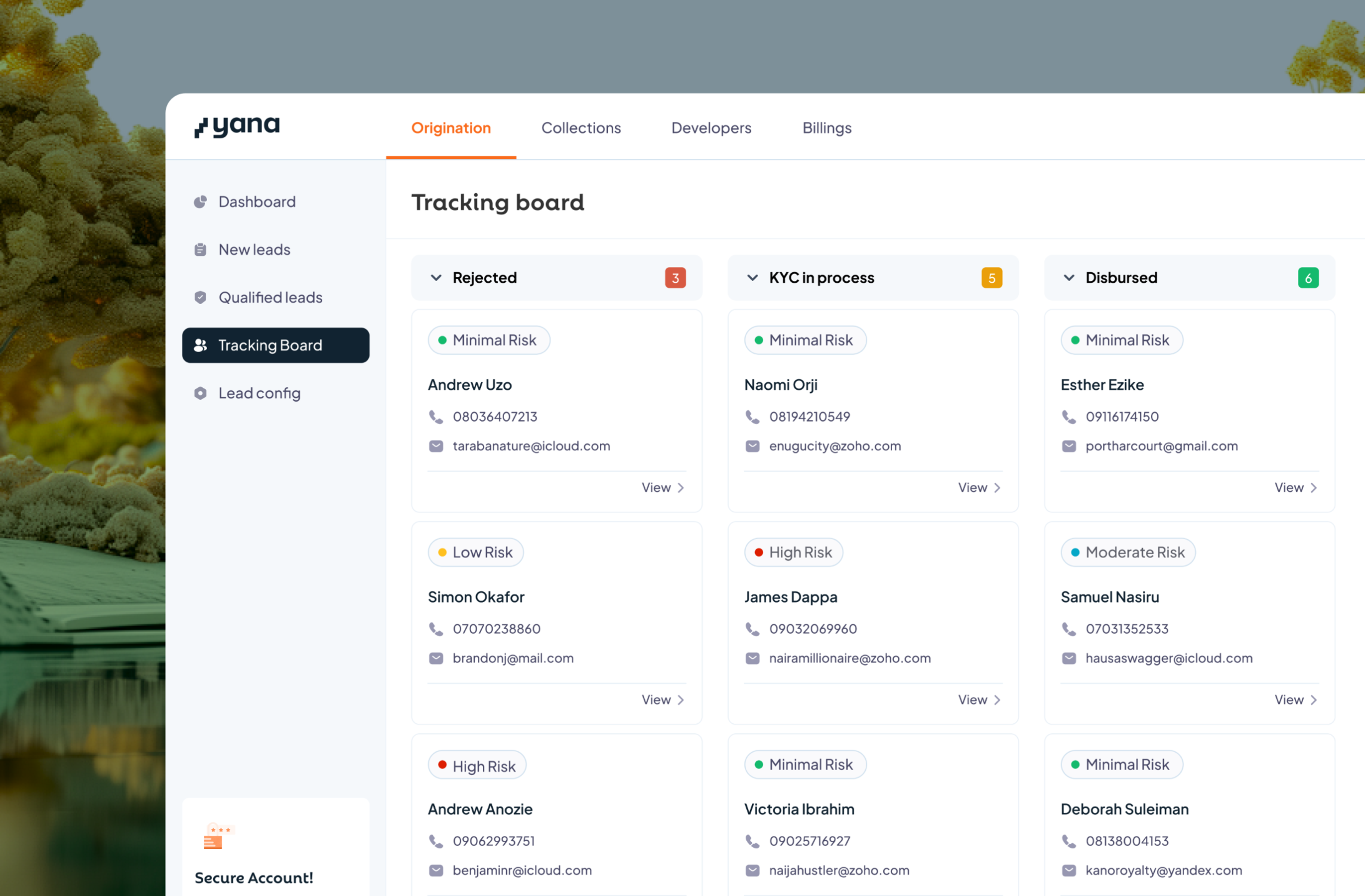
- Product halts at the end of the origination process (Lenders requested a way to link the origination phase with the other credit phases for tracking continuity
Final Design Choice:
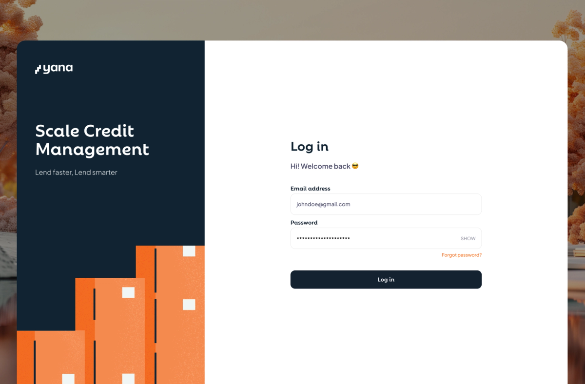
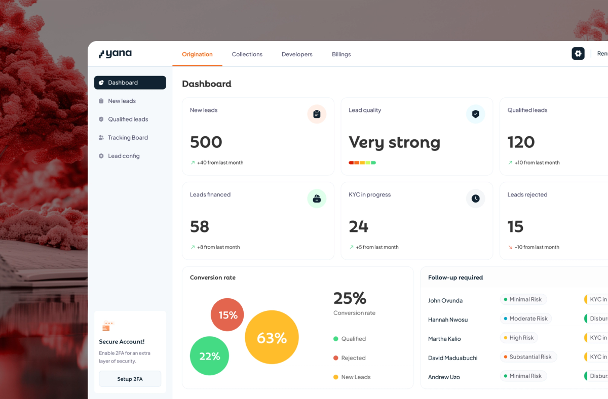
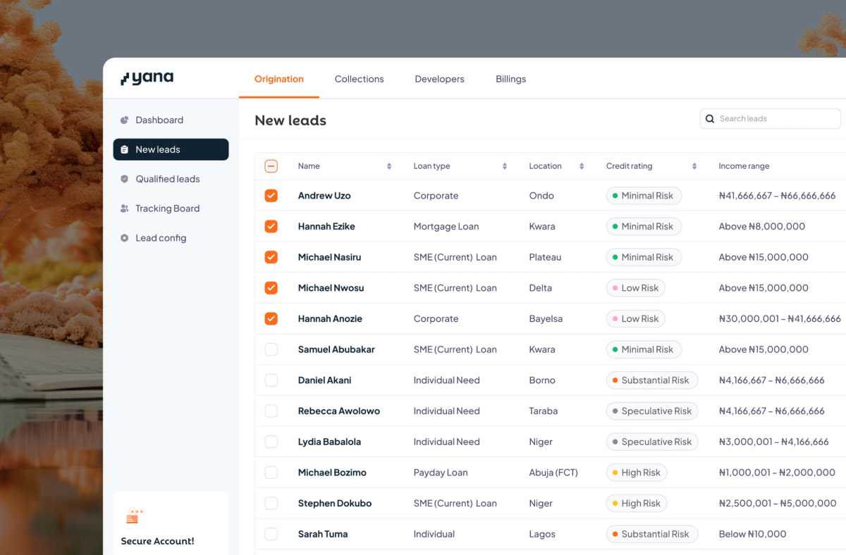
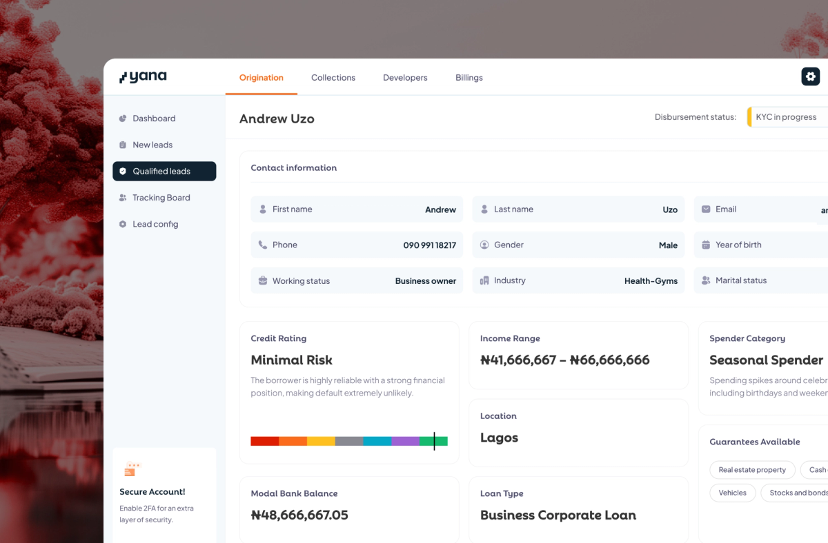
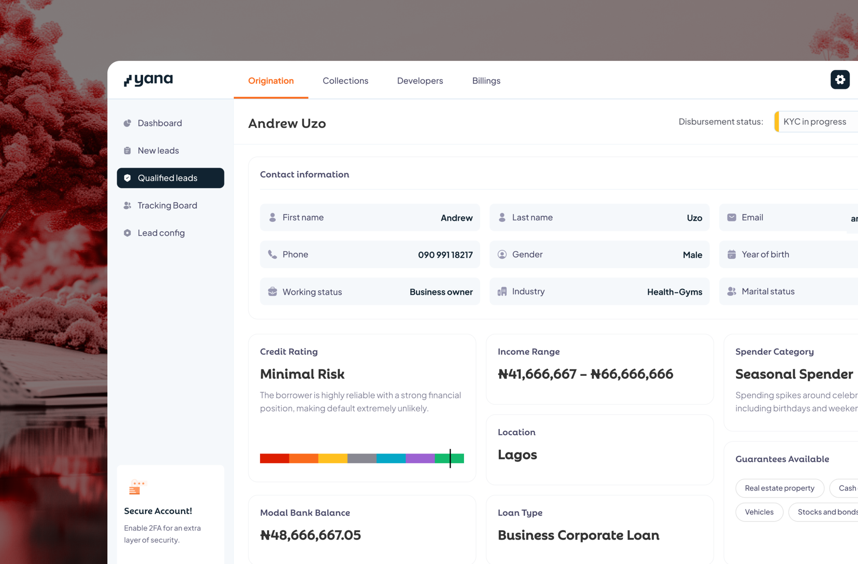
I designed a layout that shows complete credit breakdown + our risk assessment, but makes the rating explanatory, not prescriptive. Full context: income range, loan history, account activity, spender profile, collateral. Lenders make the final call.
I created a preference configuration panel that lenders can always use to continuously tweak their lead preferences.
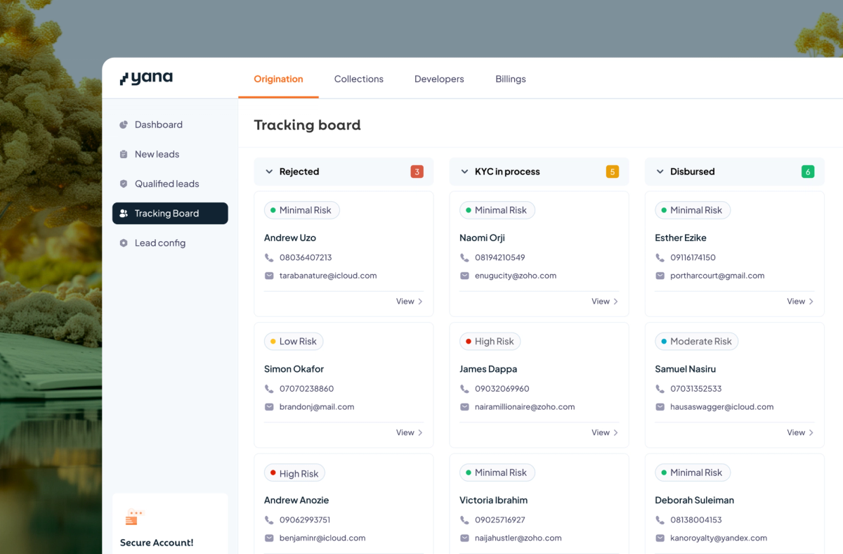
To ensure lenders can link origination to other credit phases, I designed pipeline tracking to ensure they can track a lead from conversion to credit disbursement.
Why It Worked:
Lenders aren't looking for automated decisions; they want automated research. I designed the dashboard to cut their qualification time from 6 days to under an hour by frontloading the information gathering, not the decision-making.
Lenders need a flexible system that caters for changes in their business operations as well as a system that can fully integrate with the rest of their processes. The continuous config and pipeline trackers I designed reduced churn by 50% and became our major sales point for onboarding new lenders.


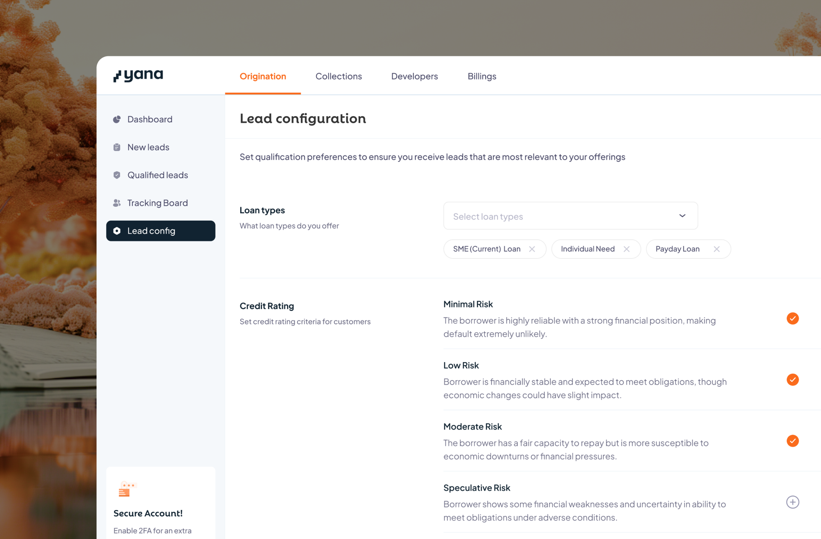
Careful Details That Made It Awesome
To ensure the product effectively performs the function of making credit a daily financial operation for borrowers, I designed some key experience shapers.
These key functionalities improved the product's performance and increased users' interest in credit through engagement, personalisation and habit building.
Here are the details that nailed the experience:
Milestones, Achievements & Customisation
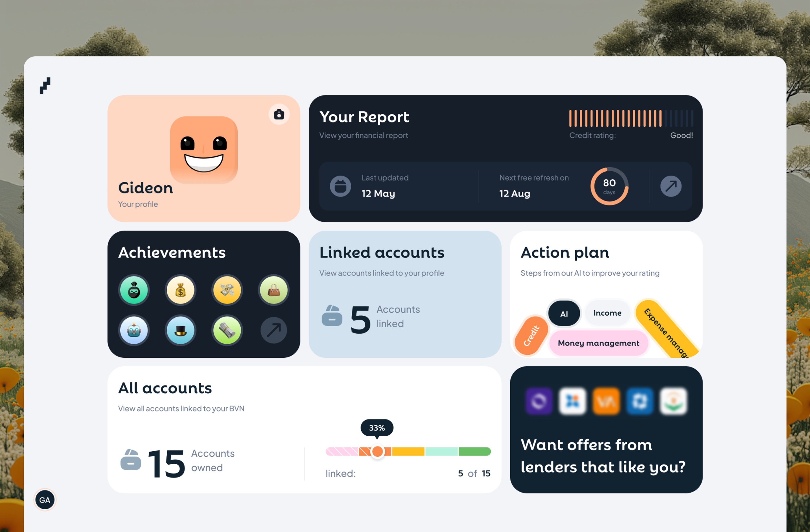
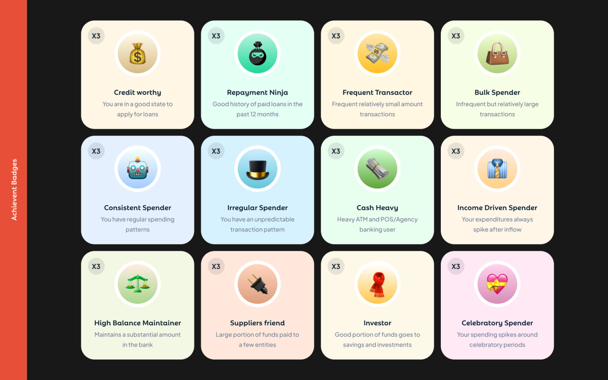
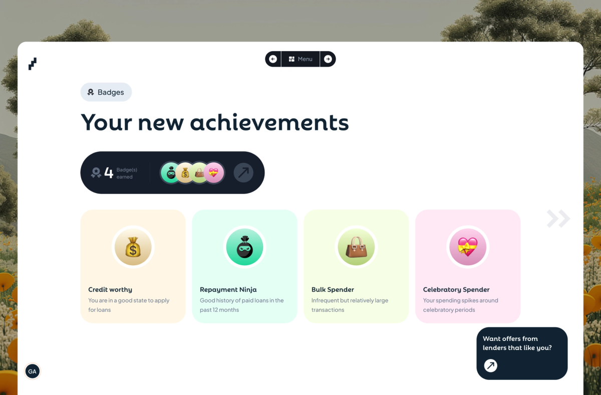
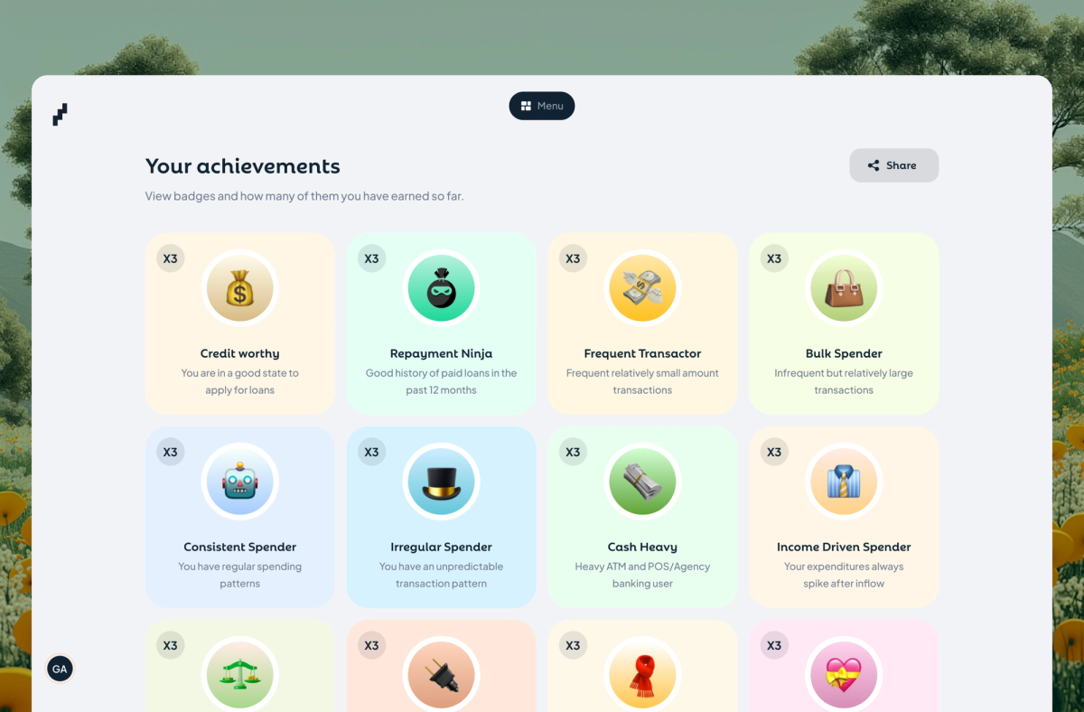
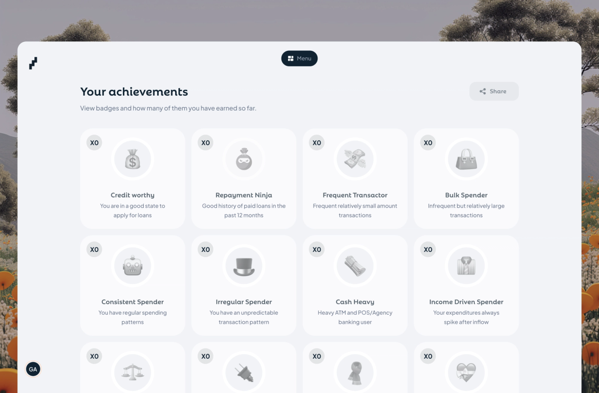
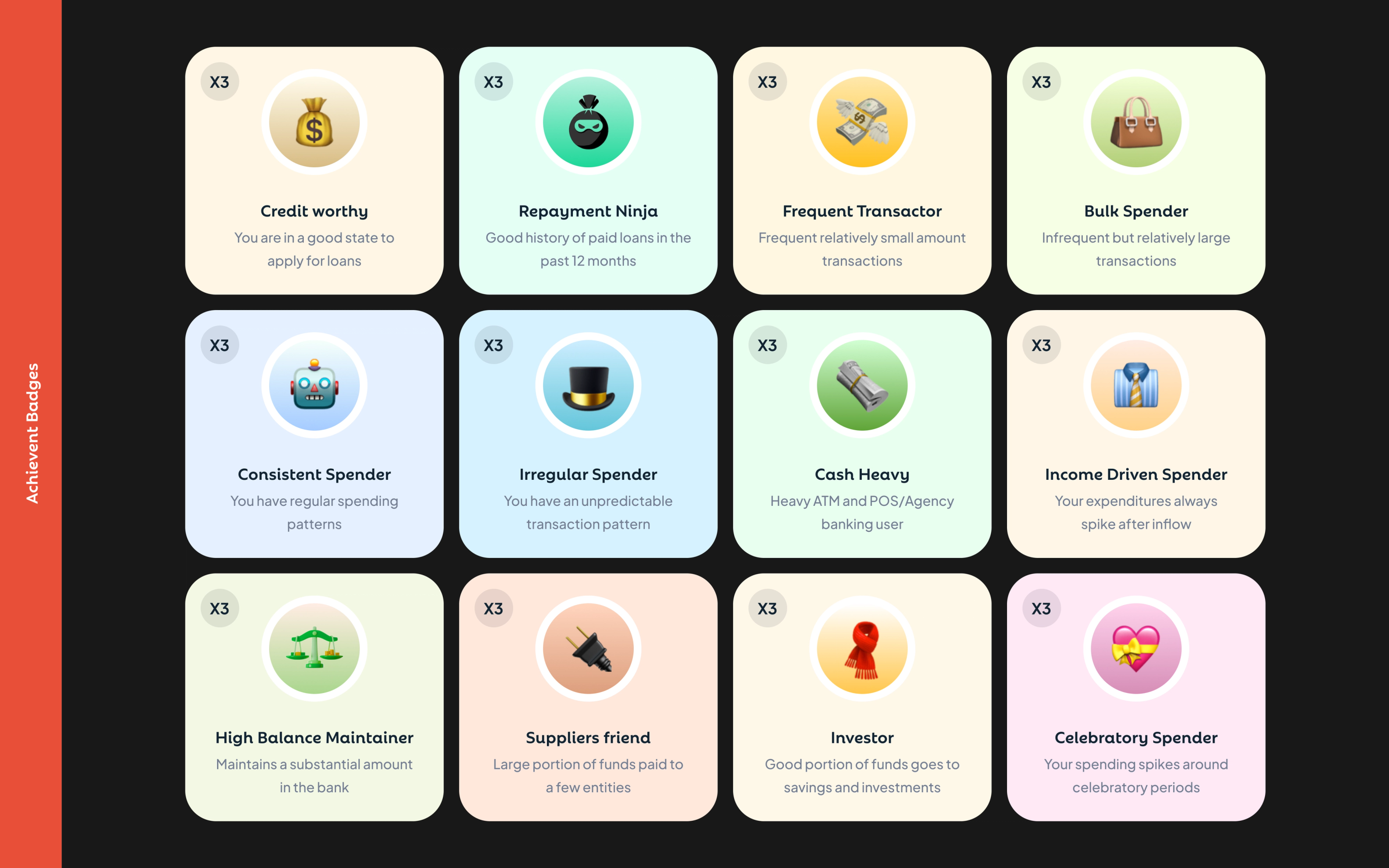
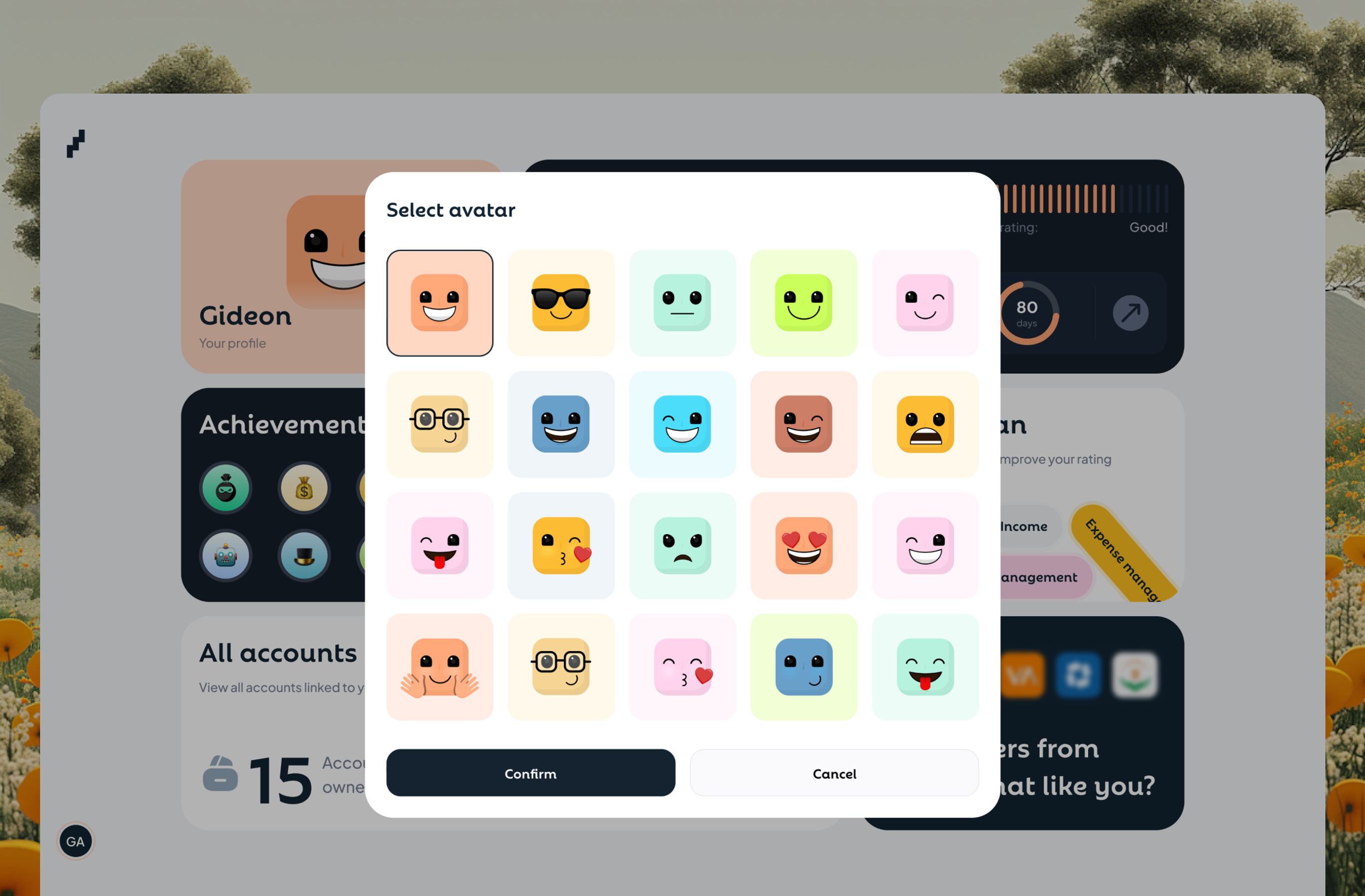
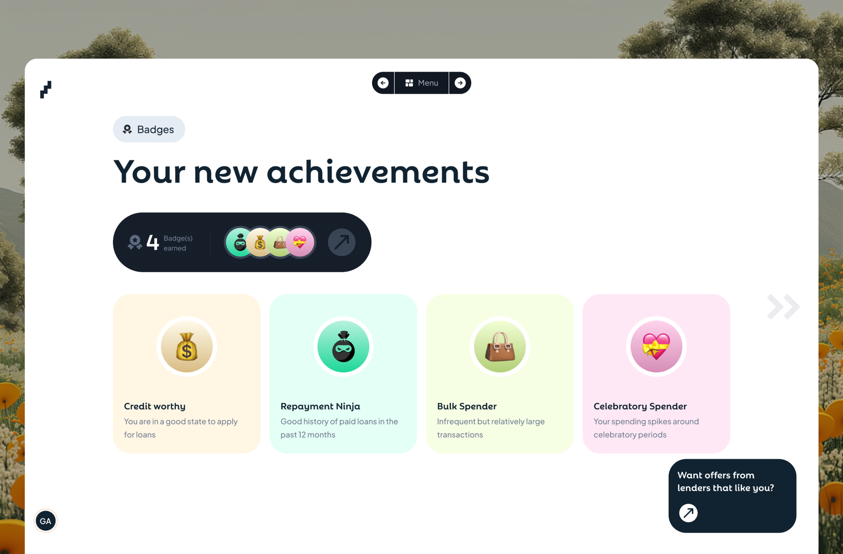
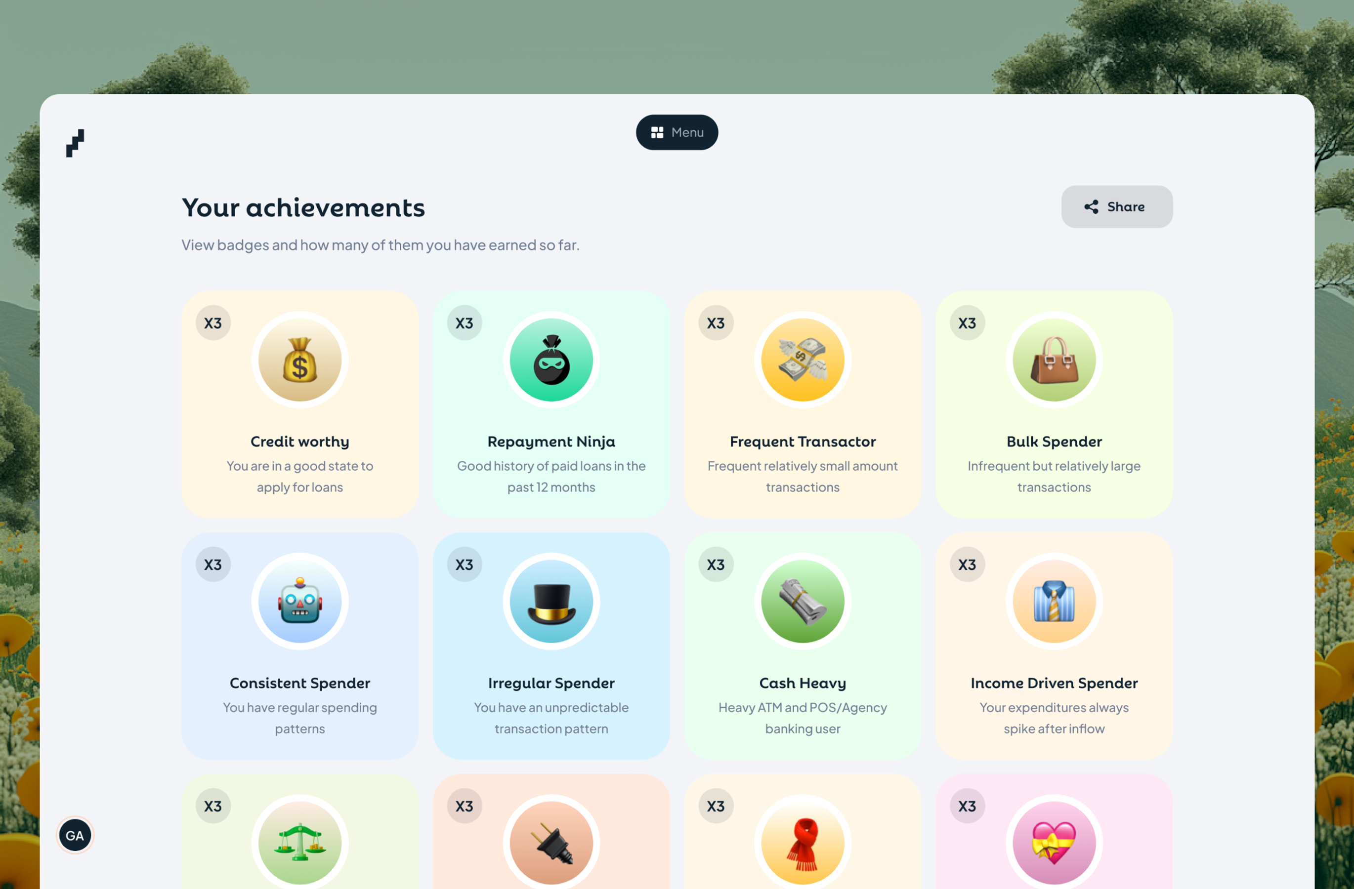
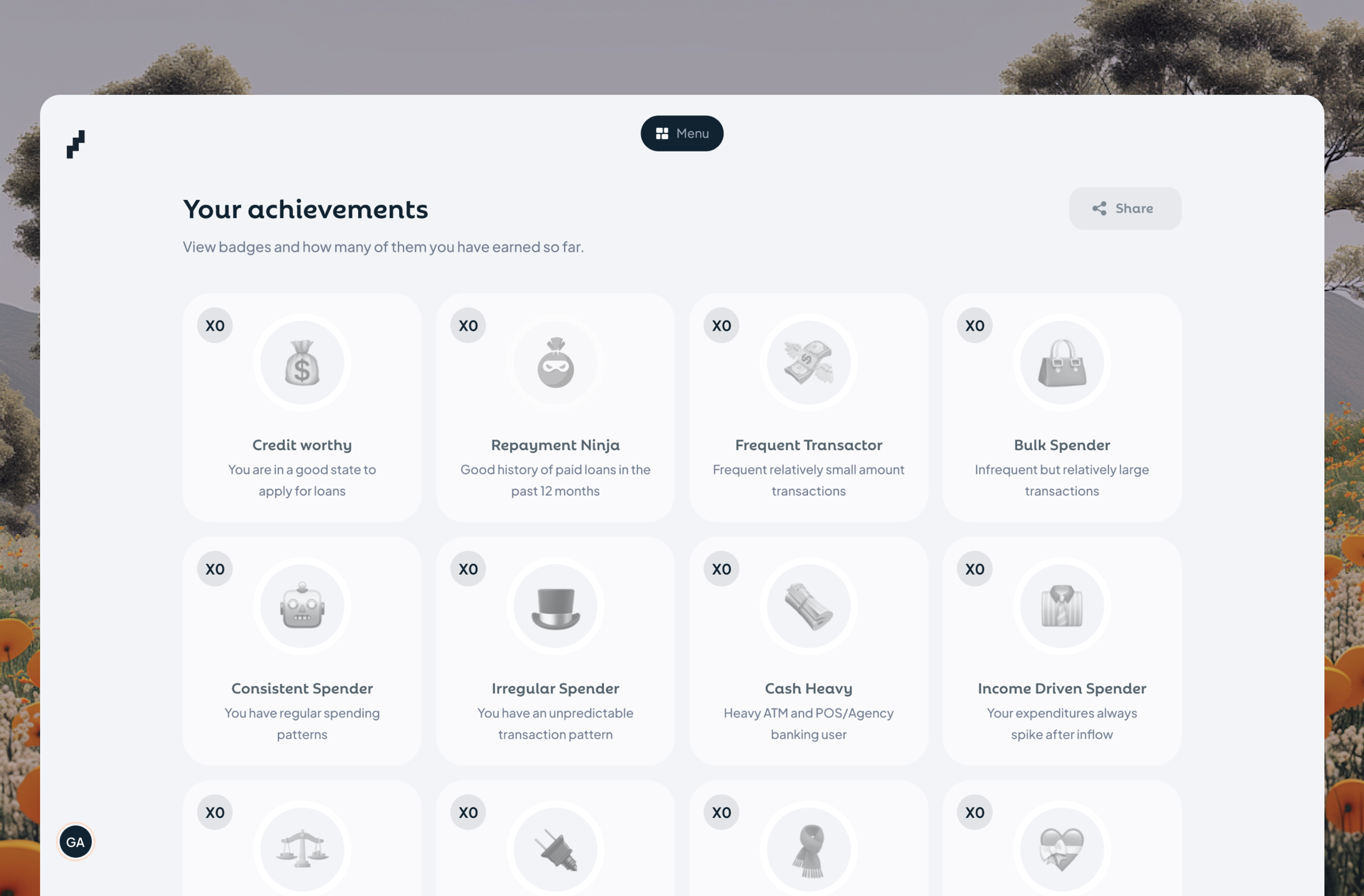
I needed users to return regularly to update their credit performance, but checking your credit score isn't naturally habit-forming like social media. My approach: turn credit improvement into milestones and achievements. I designed 12 achievement badges based on real financial behaviours lenders care about.
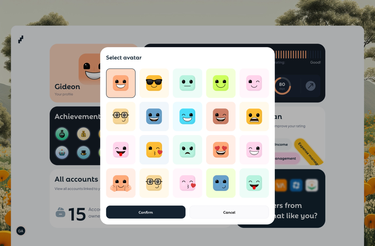
I also designed delightful personalisation elements for users without distracting them from the main purpose; affordances to choose fun avatars and change theme were all added to make the product an engaging financial home for users.
The psychology:
People don't return to check numbers, but they do return to track milestones and engage with a product showing them the hard part of credit, but in a fun way. In turn, they track their credit behaviour and get offers.
Result:
On deployment, there was a 43% increase in users returning weekly to use these features while refreshing their report. Users also shared achievement badges on social media, and that’s free marketing we never asked for :).
AI Recommendations, Reminders, Lender matching
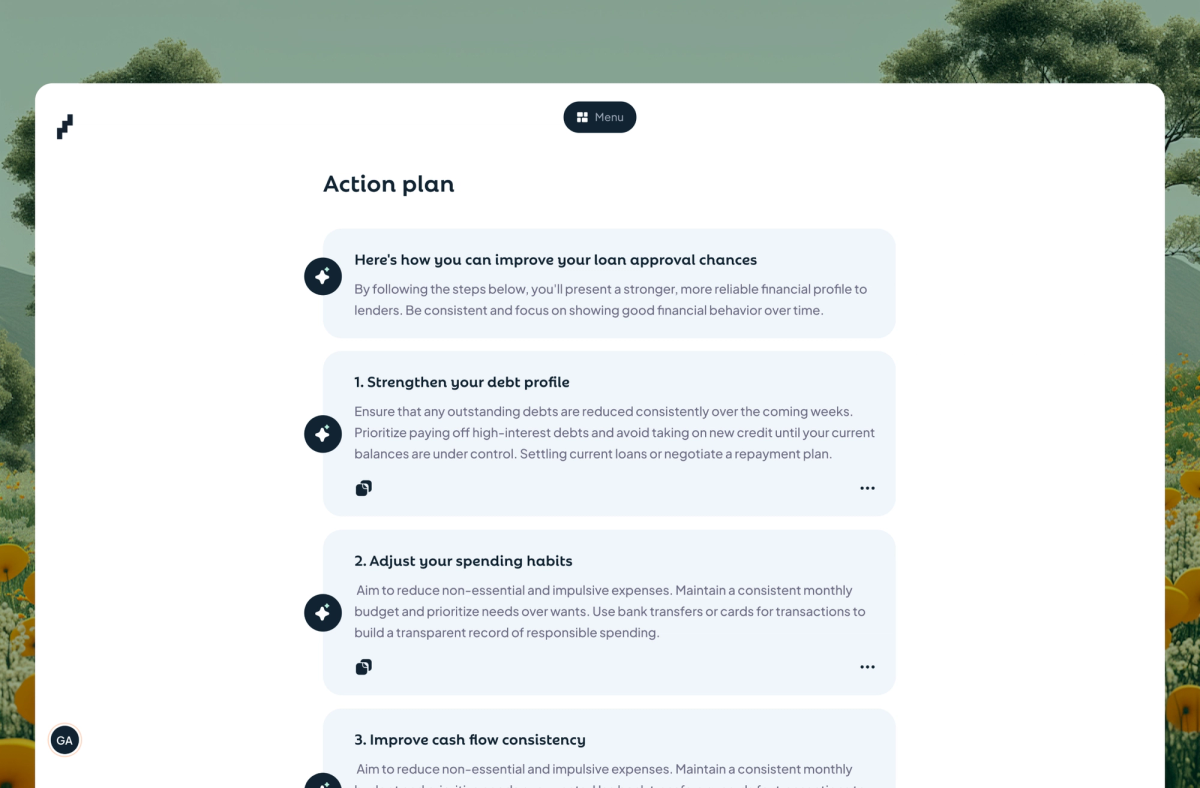
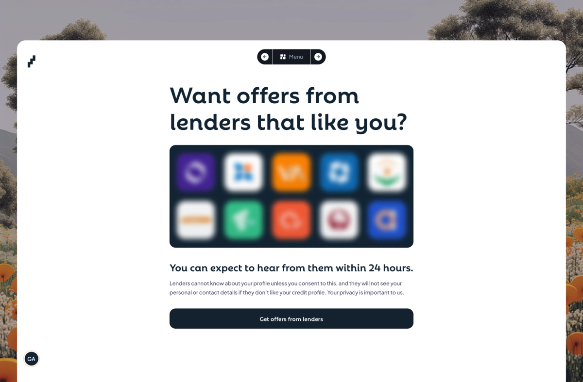
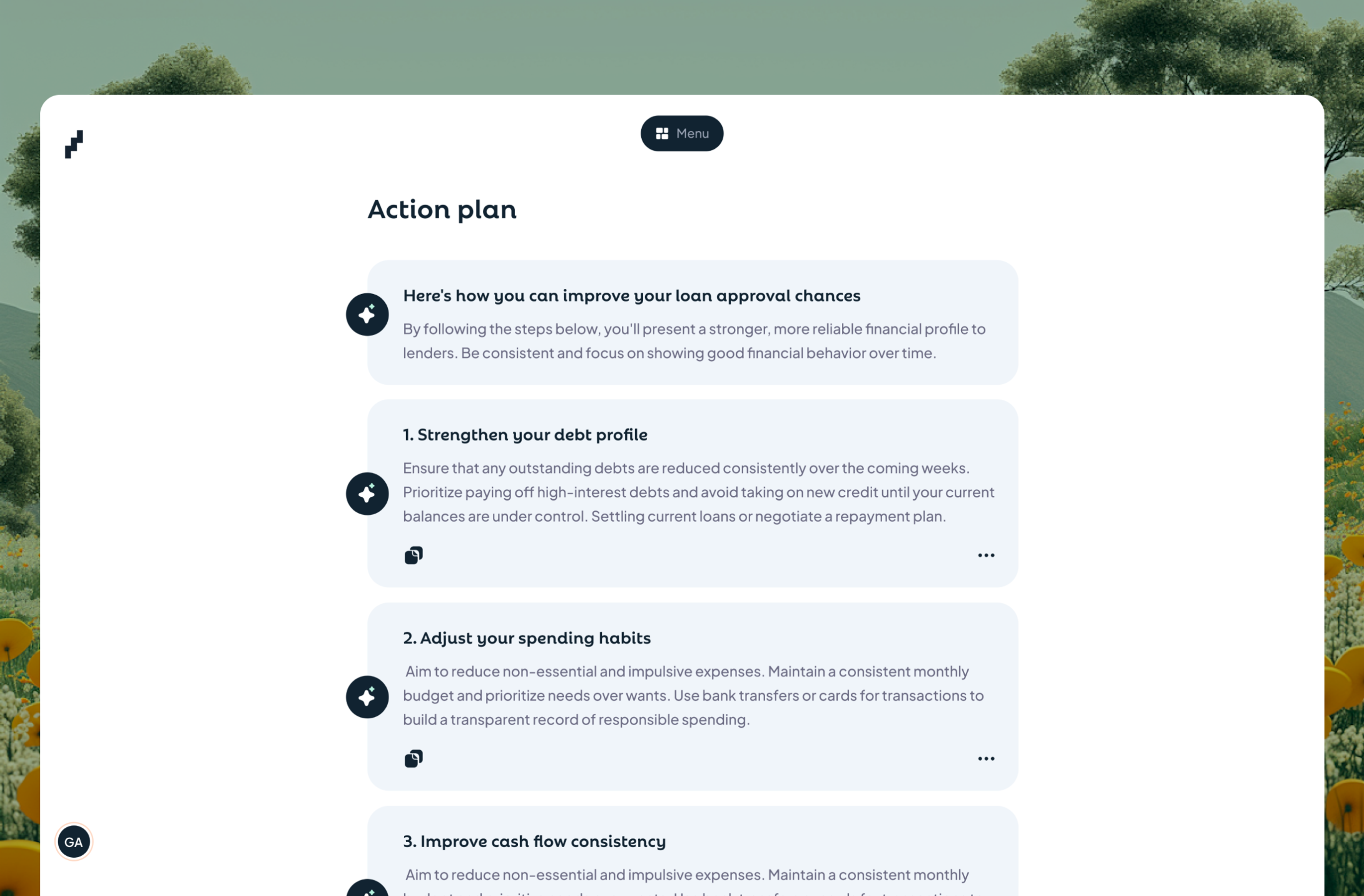
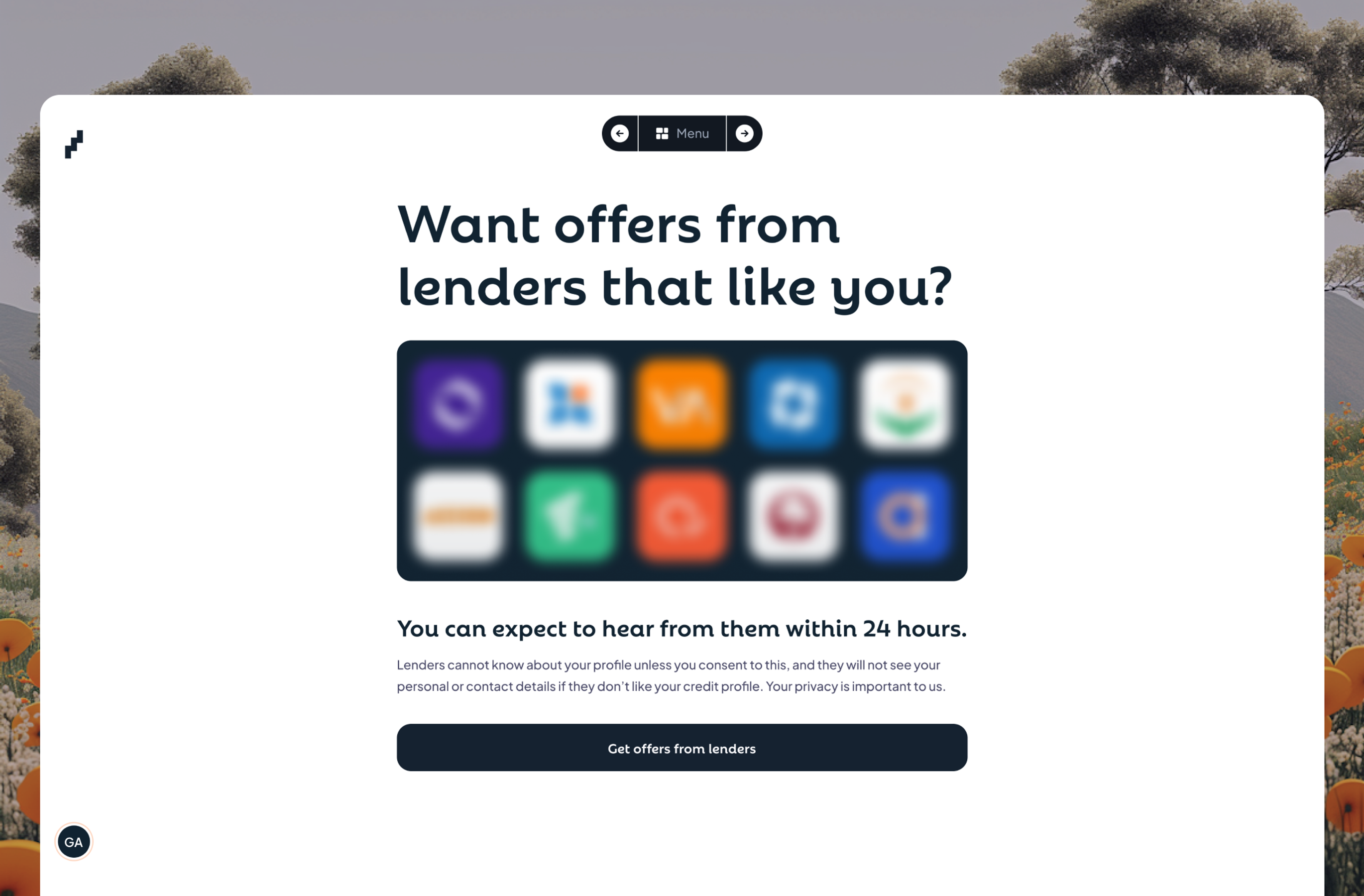
To improve credit habits and provide credit offers for borrowers, I designed three features as one continuous loop: AI action plans that give guides based on the user's actual report, notifications to remind users when reports need refreshing or when their score or performance changes, and seamless lender matching where one submission pre-qualifies them across multiple lending companies.
With this, users don’t have to be in the app to manage their habits. From getting an action plan that becomes checklists you can track within and outside the app, to notifications that alert you to habit changes, score changes, checklist reminders, and preparing your eligibility for quality lender matching and loan offers.
The psychology:
Action plans give agency (here's what YOU can do), reminders create habit loops (come back regularly), matching provides payoff (your work connects you to real opportunities). Instead of "check and forget," users get a path forward with built-in accountability. Lenders, in turn, get a pool of qualified borrowers.
Result:
97% of the users read their action plans, 68% who receive reminders take action within 48 hours, 54% opt in for credit offers, and those leads convert at 31% - 4x the industry standard because both sides are pre-qualified and timing is right.




What Actually Changed
Borrower side:
- Over 6,000 credit reports generated in the first six months
- 78% onboarding completion (up from 34% in my early versions)
- 71% of users generate their first report within 24 hours
- 43% return within 30 days to refresh their data
- 54% opt in for lender matching
Lender side:
- Over 20 lending partners actively using the platform
- Over 50,000 qualified leads generated
- 31% lead-to-loan conversion (vs 8% industry standard)
- Lead qualification time: Under 1 hour (vs 6 days previously)
- Lenders now process 4x more applications per month
"I stopped asking 'How do we lend better?' and started asking 'How do we make lending work for everyone?' Turns out that was the whole problem."
Lessons Learnt
Users don't want "easy"; they want clarity.
My instinct was to hide complexity and make everything smooth. Users saw that as suspicious. Adding intentional friction increased trust and completion rates.
Metrics lie when you measure the wrong thing.
61% of users generating their report twice felt like success until I noticed only 38% submitted for lender matching, which is the actual business goal.
If it's not working after a few iterations, it's probably solving the wrong problem.
Early me would've spent months "optimizing" throwaways. If it doesn’t work after few iterations, it’s likely not solving their actual problem. Kill fast, learn faster.
Conventional doesn’t always mean the best.
Design for the context, not the ideal
Gamification only works when tied to real outcomes.
Achievements worked because they connected to behaviours lenders care about. Social comparison failed because it created shame without value.
Always cater for the immeasurable
Design to capture measurable and immeasurable user experience factors.

0%...
Because the smallest design
decisions can change how we
all experience the world...